As I was checking ticket prices for flights back to the UK this summer, I happened to use the websites of several airlines. The variety in terms of design and the quality of that design was noticeable.
I’m always interested in the different approaches that web design teams take when creating websites within an industry that share many common characteristics, so I thought I would look a little wider at airline websites from around the world and see which ones appealed to me the most from a visual standpoint.
Despite the budgets that these companies spend on their online presences, in my opinion, the overall quality of these sites was poor to middling. Nevertheless, I did find eleven sites in my by no means exhaustive review that caught my eye.
Let me know in the comments if I missed any other examples of good airline website design that stand out to you.
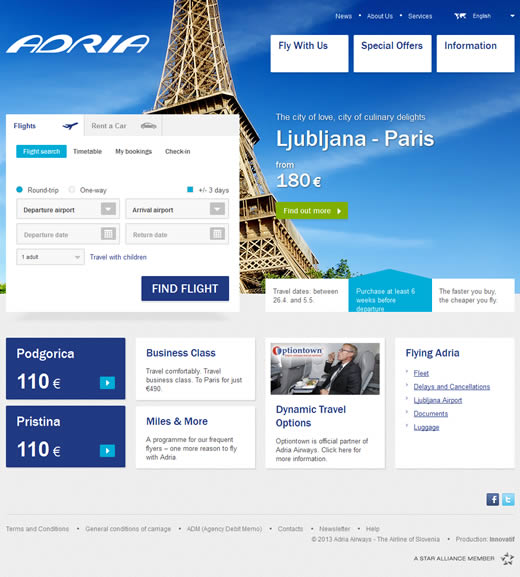
Adria Airways
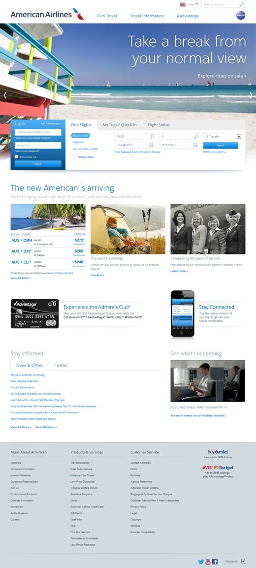
American Airlines
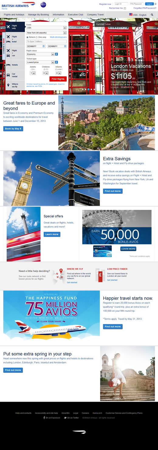
British Airways
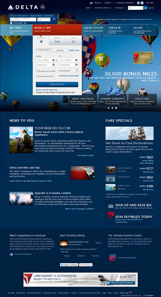
Delta Airlines
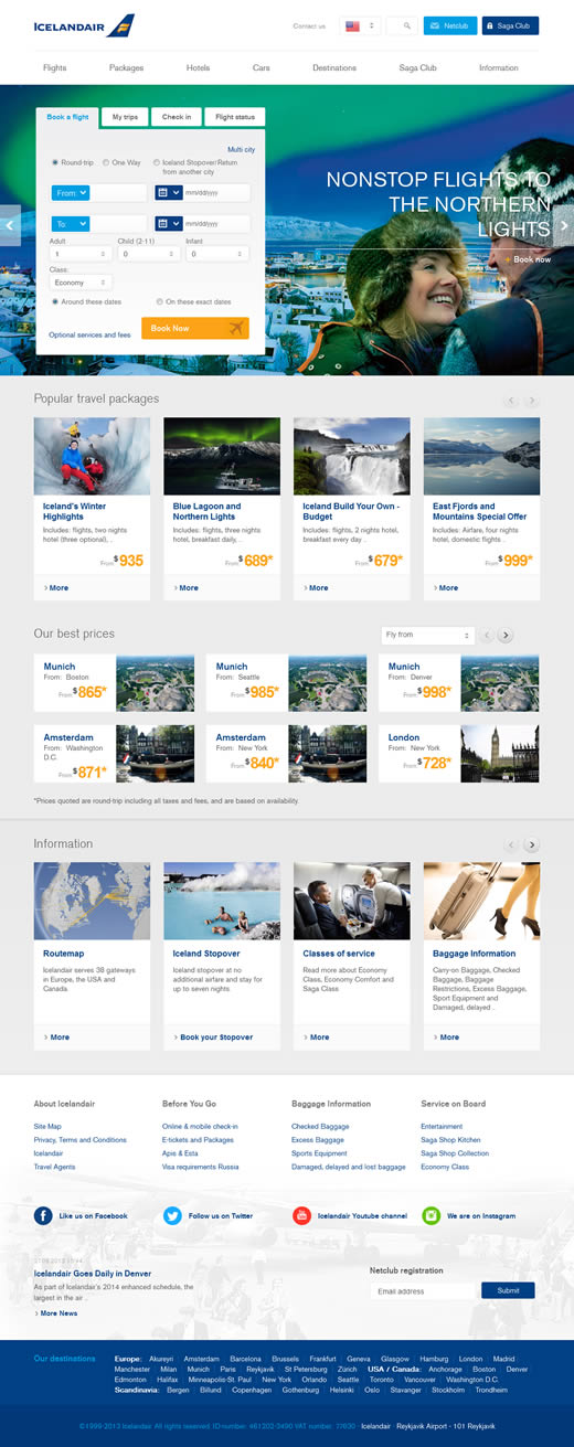
Icelandair
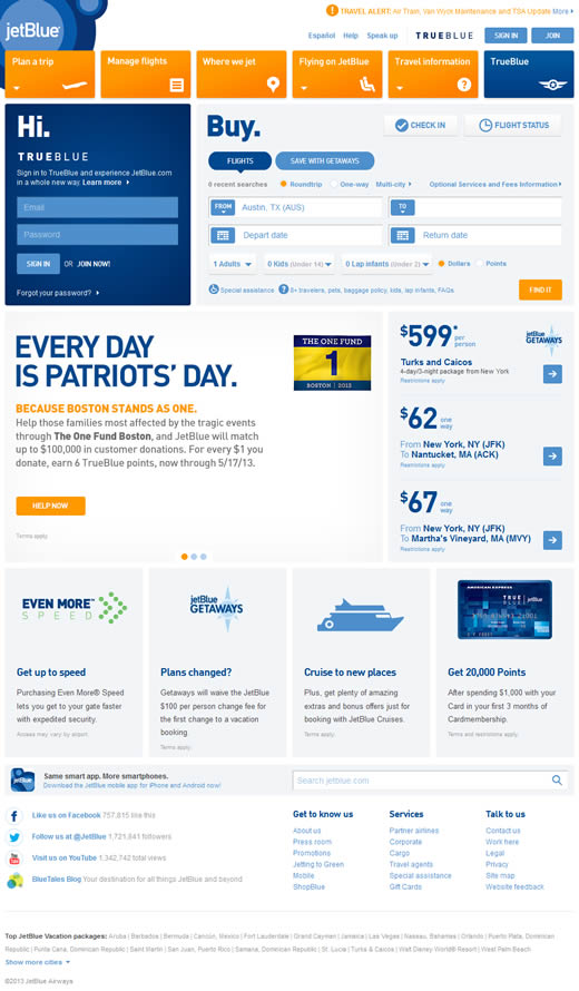
JetBlue
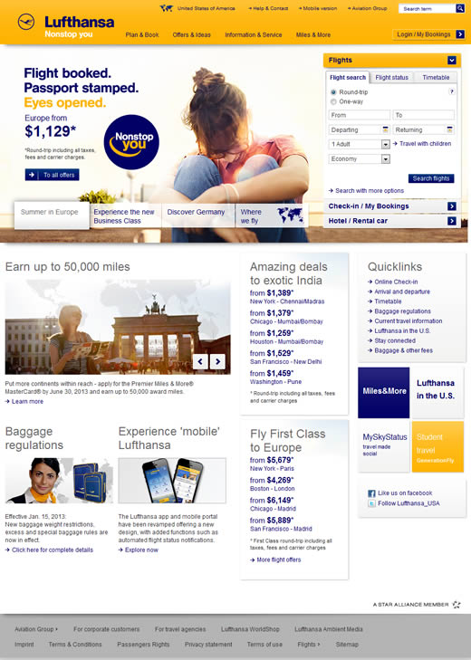
Lufthansa
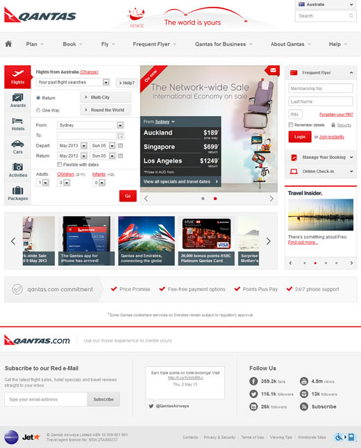
Quantas
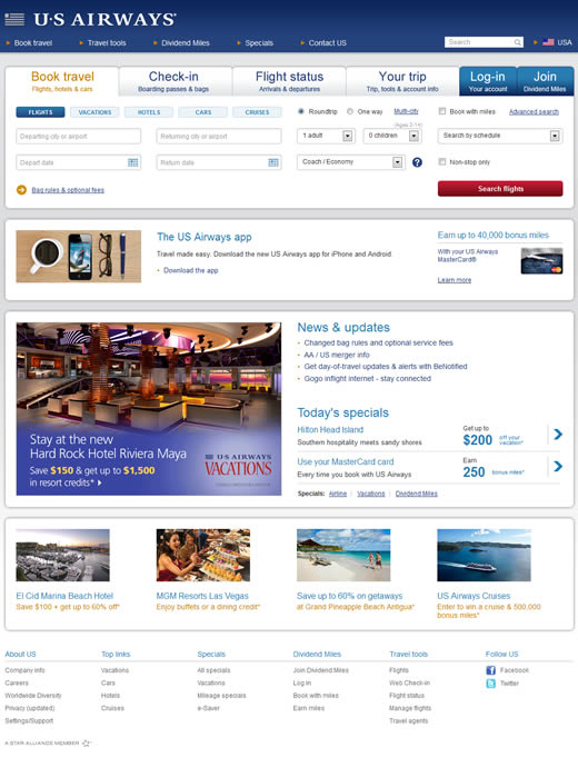
US Airways
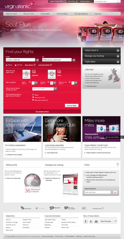
Virgin Atlantic
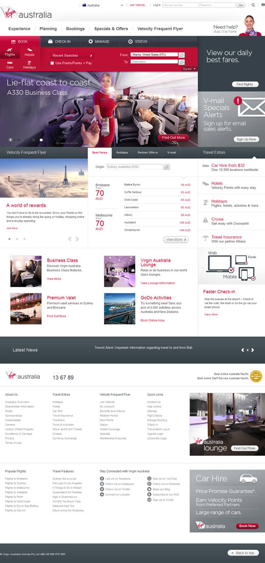
Virgin Australia
Pretty much elegant designed websites all of them. I specially liked the icelandair.
This blog site has got some extremely useful stuff on it! Thanks for sharing it with me!
Thomas John said that your design must be friendly for your customers. According to JD Power, 87% of travelers used the web to book travel tickets in 2012, yet most sites are still stuck in the 90s. That’s why the design of air websites must be user friendly to increase your exposure.
Yes, really these website designs are amazing…. Thanks for sharing with us…