We recently created our first infographic, based on the 2010 update to a long-running survey of retail theft in the US. It was surprisingly tricky to create, even though there was not a huge amount of data to present.
The main challenge came from being faced with a completely blank canvas and having so many ways to represent the information. Should we use bar or pie charts or something else?
What’s the right balance between charts, text, and images? How long should it be? And so on.
I’m pretty happy with how it turned out (props to our designer, Ismael) and am looking forward to creating more. It will also be interesting to see how well the infographic works as far as link building is concerned.
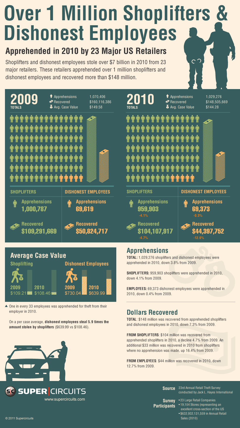
Yes good figure that shows variation over 2009 and 2010 for dishonest employees and shoplifters.
Very nice design