I’m always interested in the different visual approaches that news outlets and other media organizations take to representing major news events, and this year’s presidential election was no exception.
A key component to reporting the 2012 US election was the electoral results map. Let’s take a look at how the results of the election were presented and see what design conventions and anomalies stand out. With any luck we might come across a few innovative design approaches too.
Red vs. Blue
Starting with color, it’s interesting that no two news organizations used the same colors to represent the Republican and Democratic parties. As you can see below, the shades of red and blue used varied widely.
Here are a few examples:
| #EB0000 | #0F78D2 |
| #A61200 | #003D77 |
| #C01616 | #2C6A93 |
| #CB3128 | #45A6FB |
| #EE2E3D | #0173BC |
| #BD1E2D | #057BB8 |
| #AA2E3B | #2C5883 |
| #BC1121 | #315B88 |
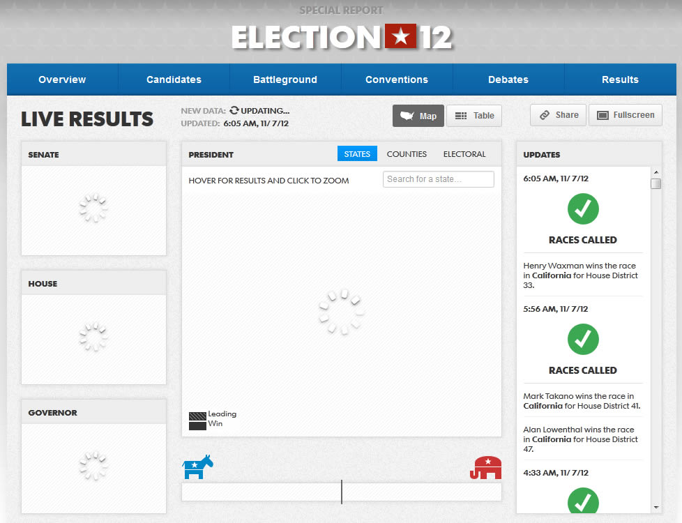
Mapping the Election
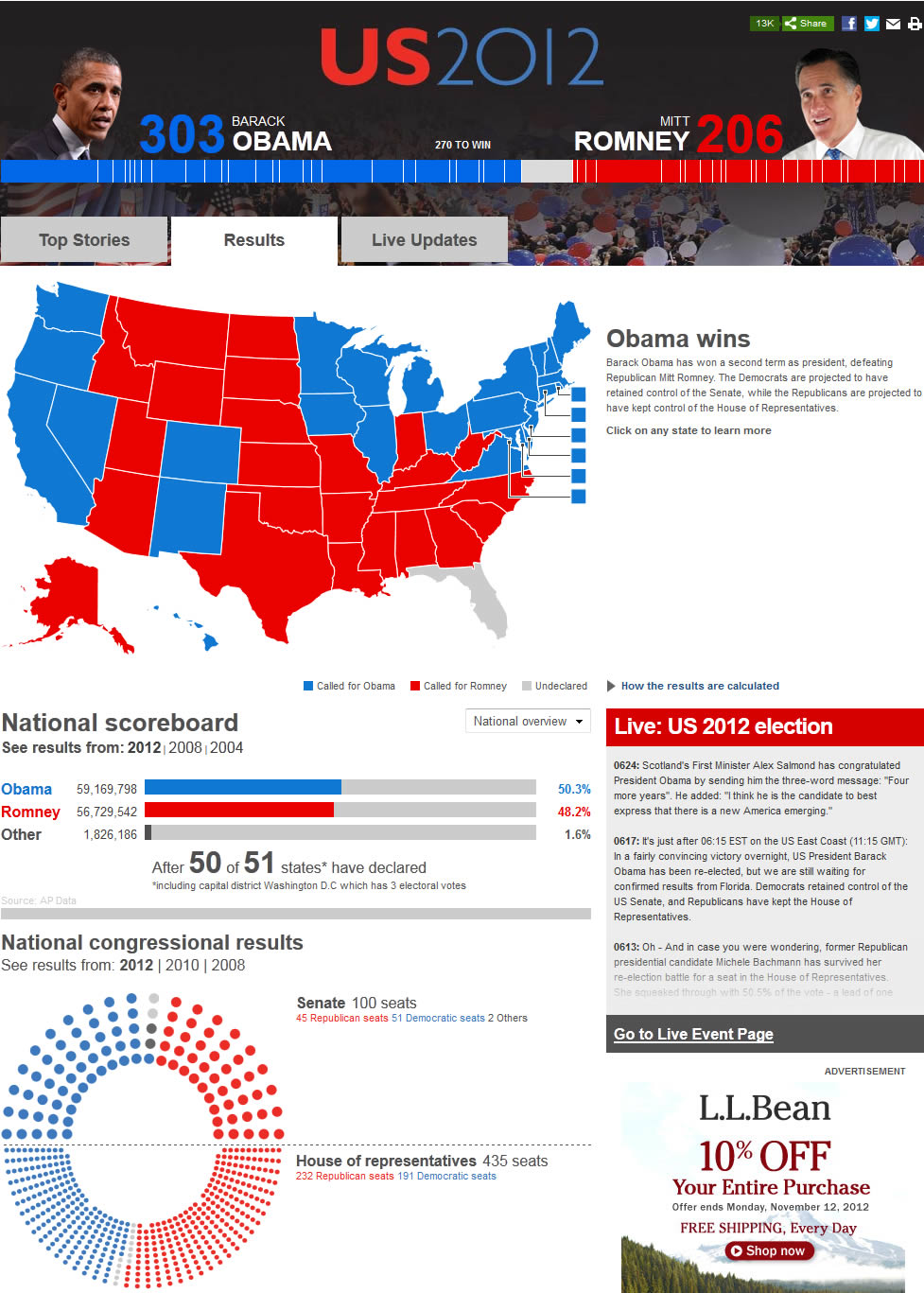
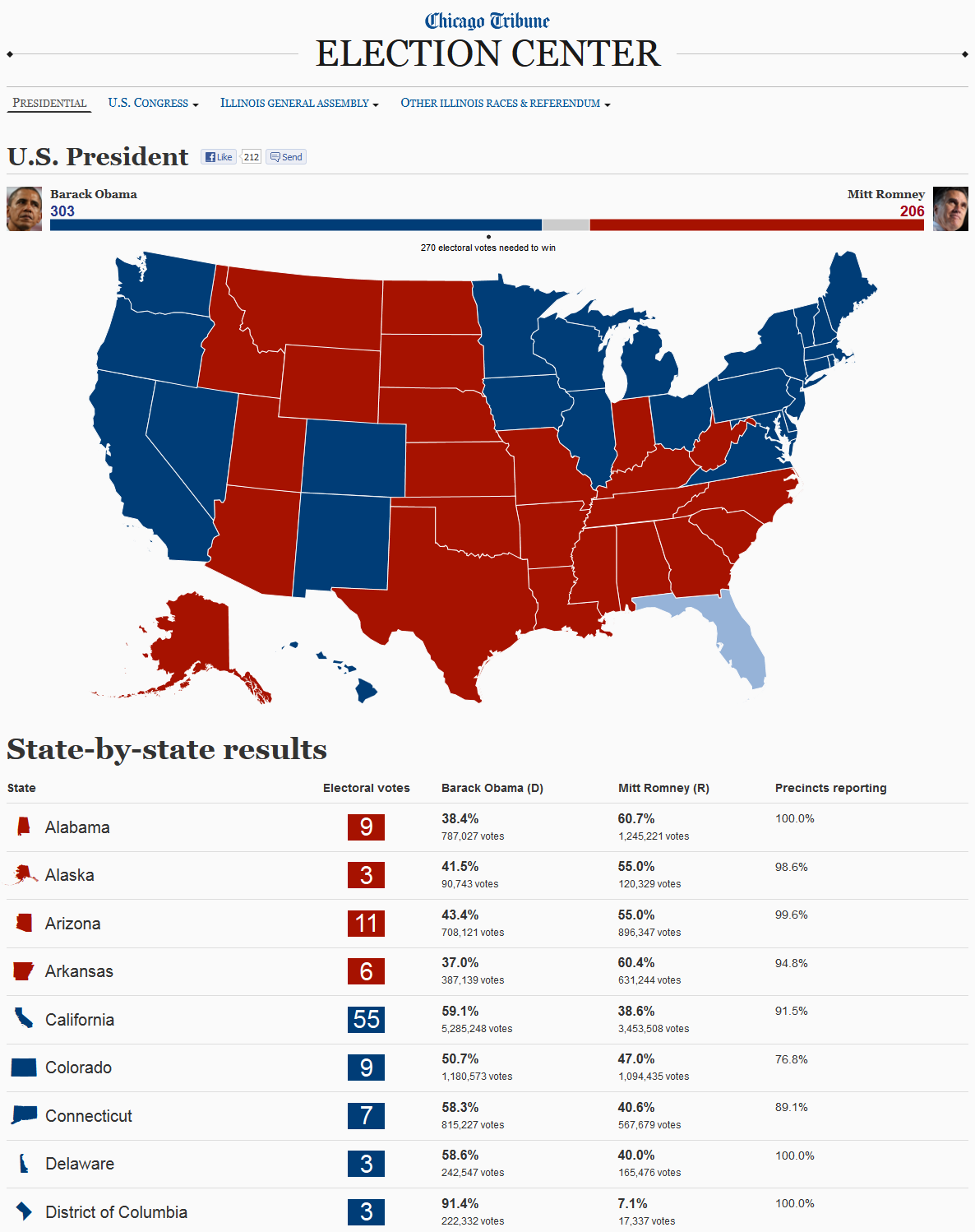
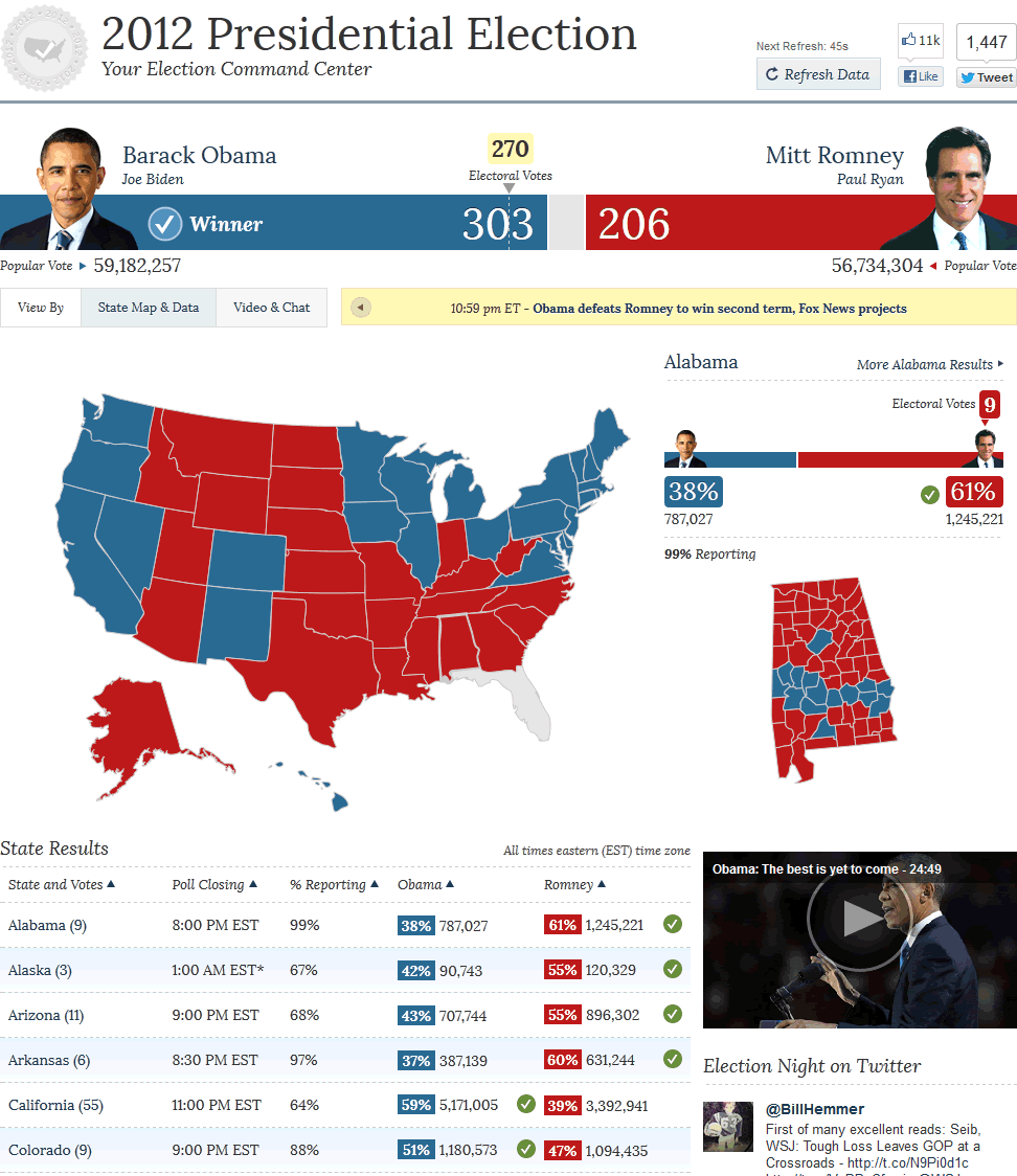
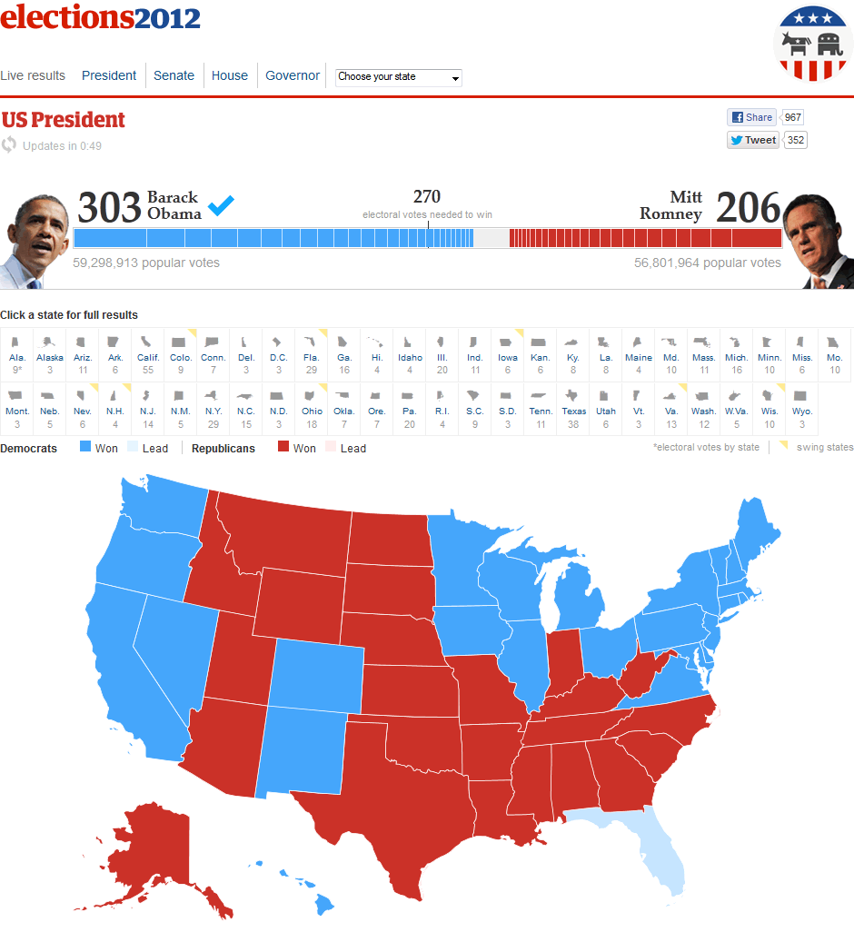
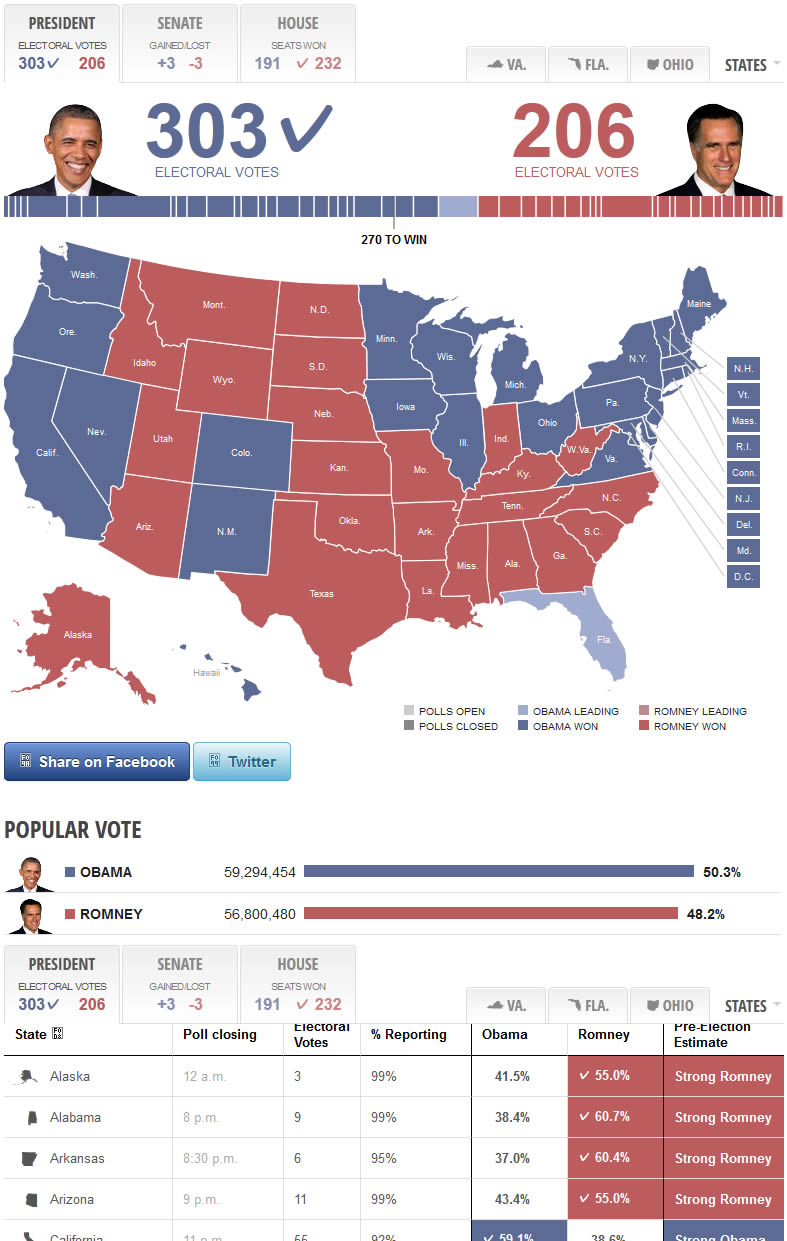
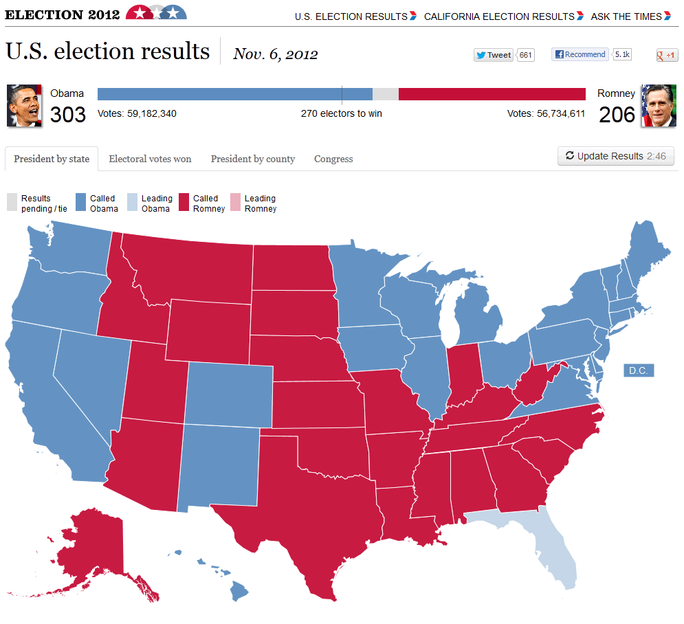
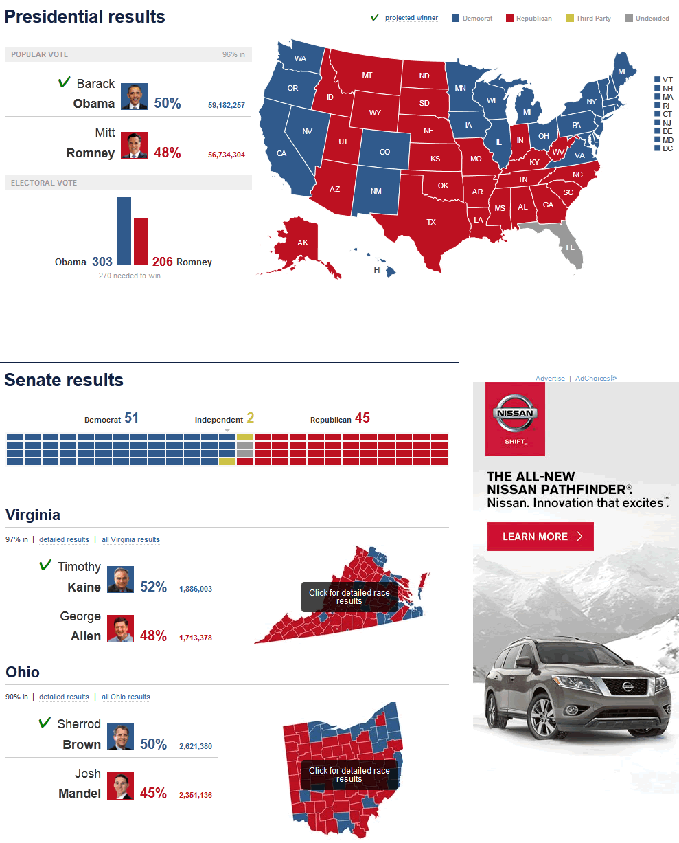
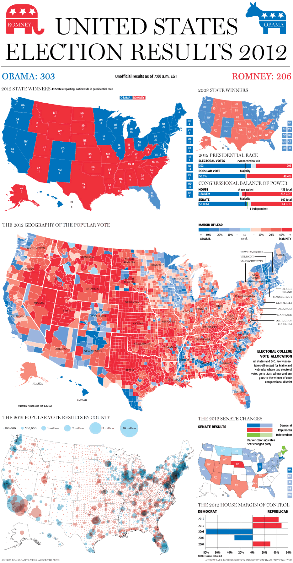
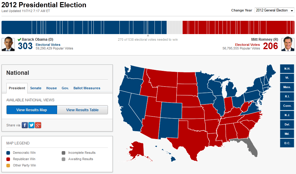
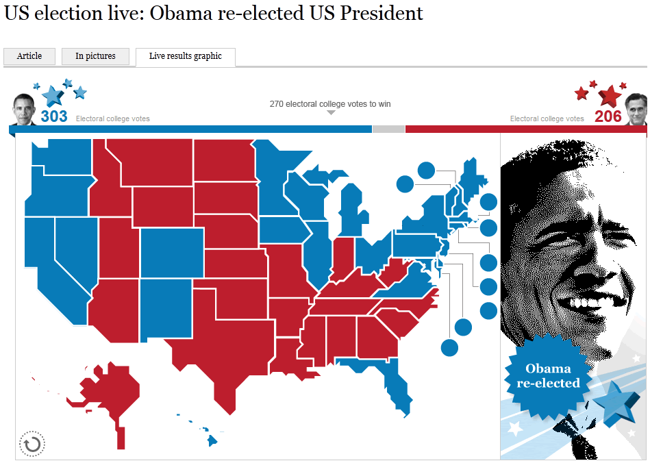
One thing almost everyone could agree on, however, was to use a map of the United States to provide an overview of the results by state. Very few websites strayed from this formula, with only the New York Times choosing not to include a map at all on their election results page.
Only The Times newspaper changed up the visual formula by using a stylized map of the US rather than the traditional cartographic version.
Most sites were content with presenting the results map at the state level, with only The National Post displaying a more detailed map of election results by county at the top level (where this information was available, other sites required you to click down into it).
Showing Who Won at a Glance
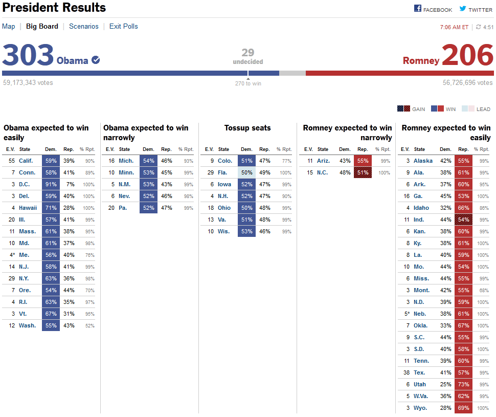
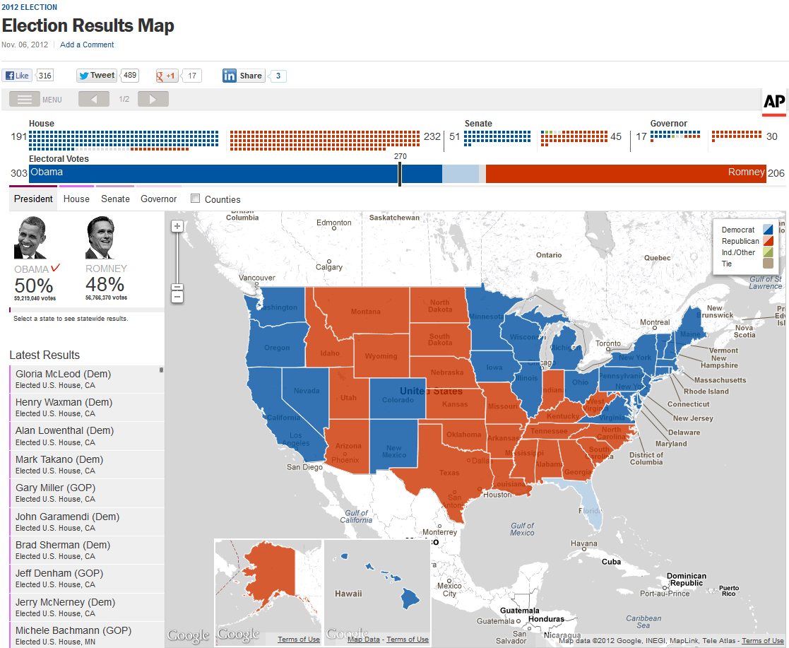
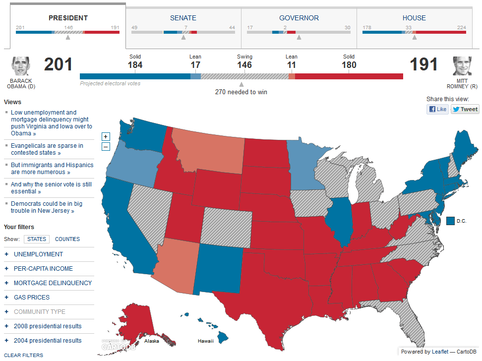
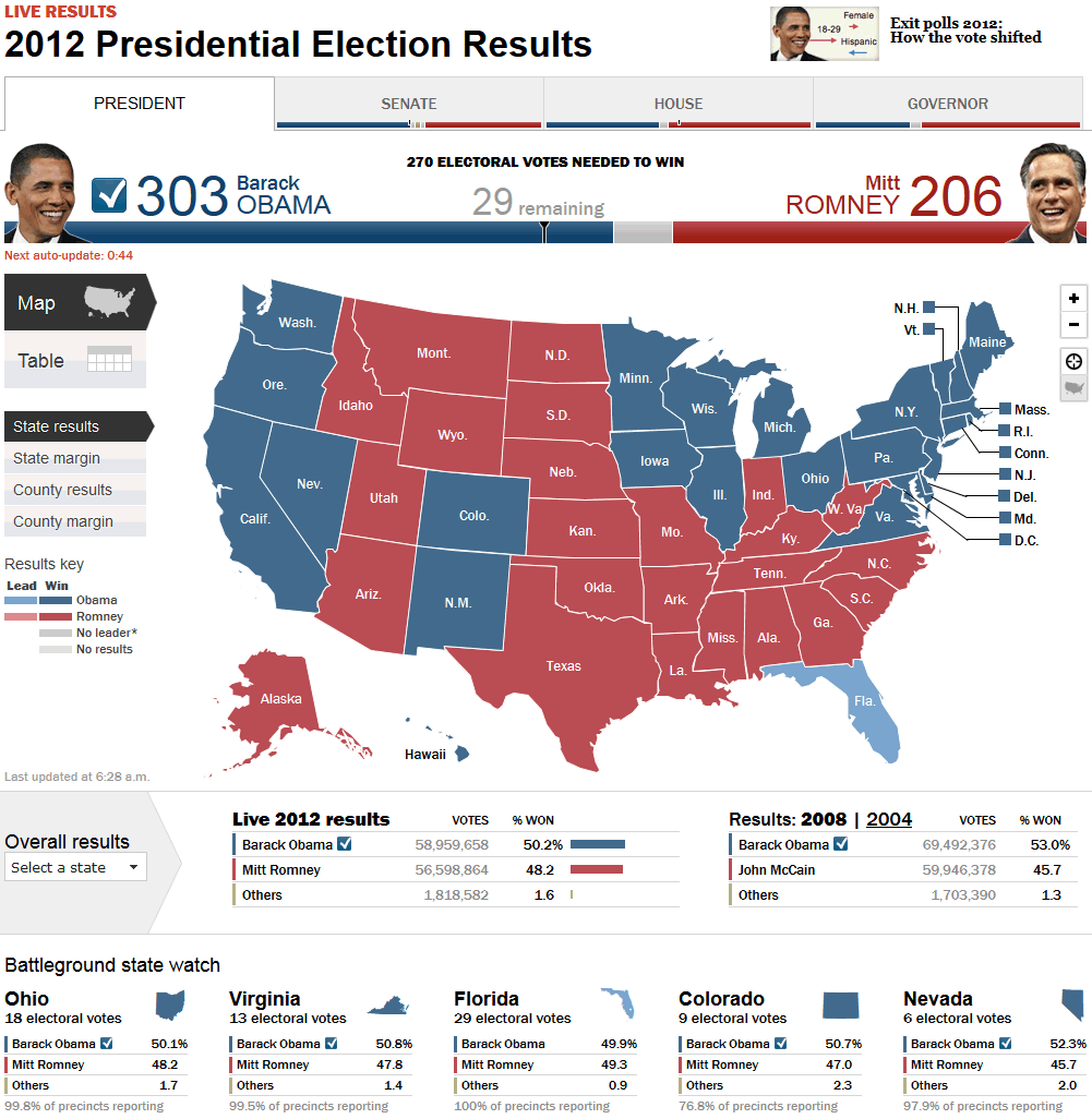
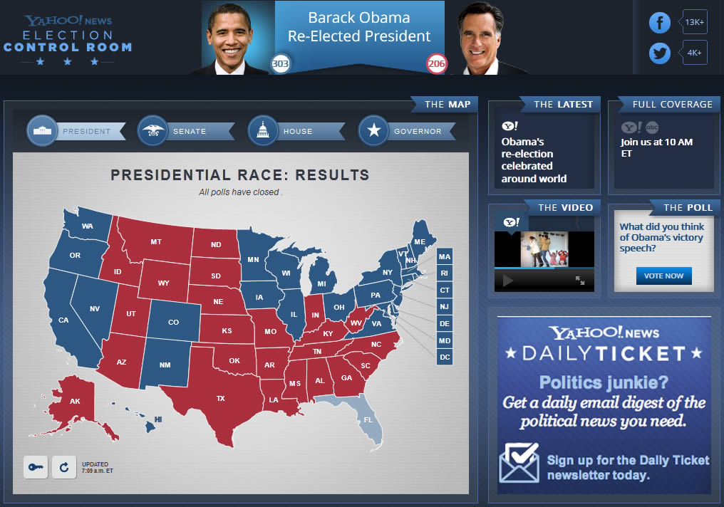
As far as representing the overall number of electoral college votes received (and the ultimate election winner), by far the most popular approach was to show the votes for each candidate filling in a single bar from either end.
While this worked well from an overall layout standpoint, it was less successful in quickly conveying the margin of victory.
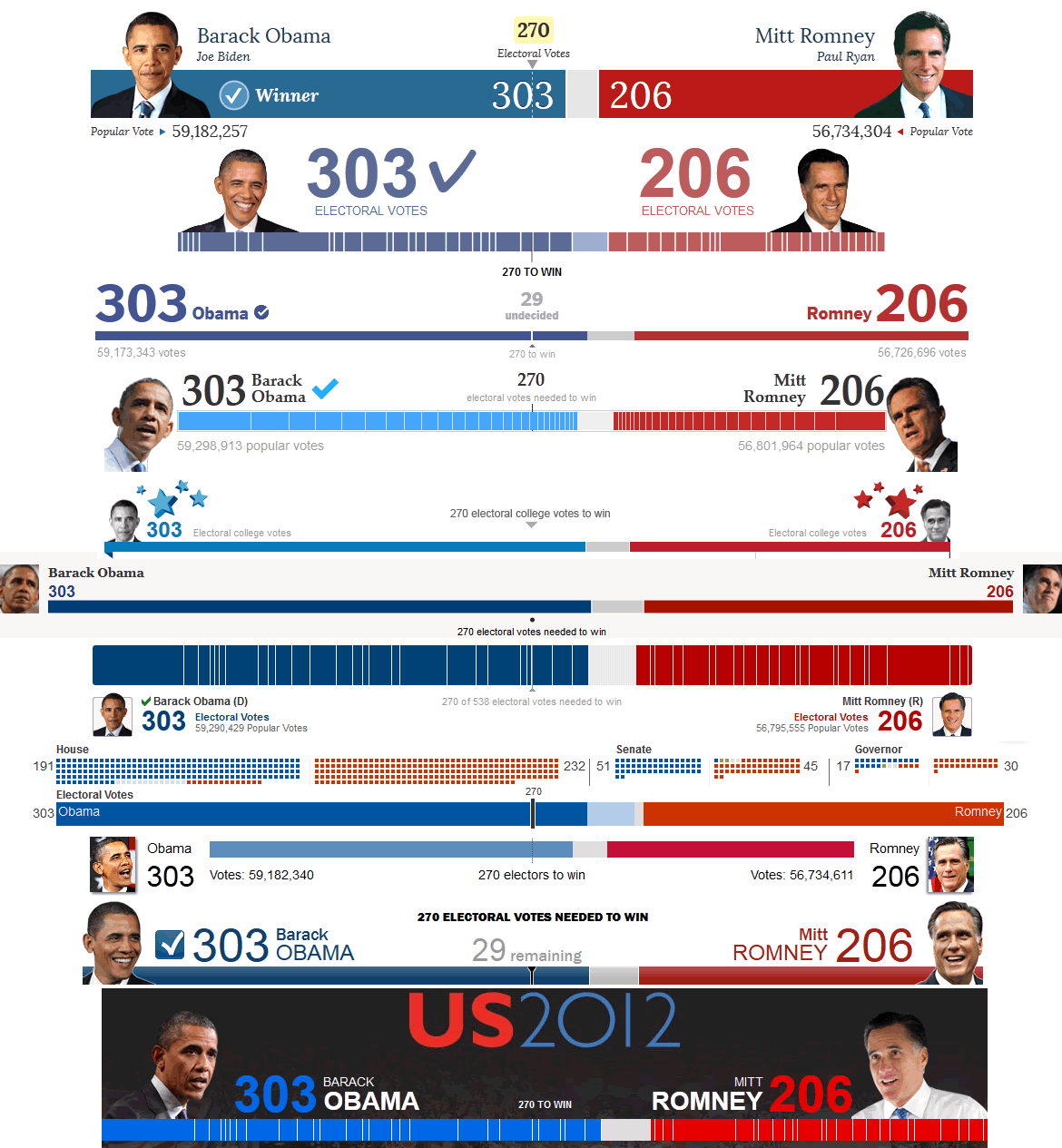
Given the popularity of this ‘electoral college header’ approach it stood out when a few sites, such as MSNBC and Yahoo! did not include it. Some sites attempted to add more value to this at-a-glance graphic by including the total number of votes received by each candidate.
2012 US Presidential Election Maps
Here’s a recap of how some of the leading online news organizations depicted their 2012 US election results maps. Got a favorite? Let me know which news organization had the best approach in the comments.

On a sidenote, no matter how many times I tried, I simply could not get the USA Today election map to load. I’m not sure if the problem is on my end or if they had technical issues.
Which is a shame, because according to this article from Mapbox, the company that built the app, it sounds like a very powerful data-mining tool.
Interesting to see everything side by side, they’re so samey, but then I guess this can be a difficult area to innovate without some risks. Personally I think the NY Times is awful, but quite like the National Post, geographic patterns are always interesting to see.