I just got a new work laptop which means that I’m now running on Windows Vista. I guess it’s an improvement over XP — at least it looks nicer and search finally works.
However, I was disappointed to discover that the implementation of ALT+TAB (or Windows Flip as it is now known) — for all its good looks — is worse than in its predecessor.
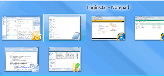
Here’s how ALT+TAB looks in Vista (flashy but hard to use):
And here’s how it looks in Windows XP (boring but functional):
While it might seem on paper that displaying thumbnails of each application is a good idea, in reality it makes ALT+TAB harder to use.
The problem is that thumbnails are too small to be useful, so I still find myself relying on the icons, which as they are now combined with the thumbnails, are harder to see.
In addition, whereas in XP it was easy to read the details of the application you were cycling through, now that the black text is overlaid onto a blue (slightly patterned) background in Vista, it is harder to read.
Looking at the screenshots above it might seem that the Vista implementation is the better one, but when you’re actually using it to quickly switch between applications it clearly is not.
Seems like I’m not the only person who feels this way.
Fortunately, help is at hand through some registry tweaking to make the thumbnails bigger. However, it’s frustrating to have to go to these lengths in order to fix functionality that should have never been broken.
In addition, I’m not that this even fixes the problem. The problem is that most applications look pretty similar in thumbnail view, so it’s not a useful way to differentiate between them.
Maybe that’s why Microsoft created Windows Flip 3D.
Agreed… There are lots of designers for Microsoft, Apple and across the web that start having fun with transparency in UI and it just makes text harder to read.
Turning off transparency in Vista but keeping Aero turned on seems to help. One alternative to ALT+TAB is Windows Key+Tab, this is the keyboard alternative for Flip 3D.
Ohh well. One step forward, one step back. 😉
Have not got Vista but like you will on my new lappie (Christmas???). Most people I have been in touch with do agree with your comments though
*Gregory* — one of the first things I did was to turn off transparency; how exactly is that supposed to be helpful? In ‘researching’ this post I discovered Flip 3D. It certainly looks cool, so I’ll give that a try instead (although it doesn’t work exactly the same as ALT+TAB).
*Jermayn* — overall, Vista (plus Office 2007) is an improvement. It’s just strange to me how certain changes are not actually for the better.
Heh, thats yet another reason to not use Vista. You’d think it would be hard, even for micro$oft to mess up something simple, but apparently its not.
It does take a while to get used to, however I found that I’ve grown to not mind it so much. The flip 3D is a nice addition, especially when I have a lot of applications open.
I don’t think the alt + tab is half as bad as turning off my laptop — close to ten different options.
*Vidar* — actually, the more I use Vista and get familiar with it, the more I like it (same with Office 2007). The search is the killer app. It is now easy to find anything.
Over the summer I was working on a rather large web project which involved Tortoise SVN and WinSSH, so I was jumping back-and-forth between multiple windows. I made Flip3D part of my workflow, and I recommend it to anyone. The ability to flip through large views of my windows and then click on the one I want (or flip it to the top) allows me to work quickly, especially when Flip 3D’s animation is usually seamless. Give it a try and you will see what I mean.
TOTALLY DISAGREE. Your way off. You mean to tell me that you would rather see 5 ie icons rather then 5 thumb nailed web pages. I’m sick of you Microsoft bashing idiots.
*Robby* — my point is that the thumbnails in Vista don’t help me to find the right application any quicker than the icons in Win XP. In fact, I find them to be harder to use.
As for ‘5 IE icons’, I use Firefox so only see one icon no matter how many tabs I have open. Do you mean to say that you still use IE6? You should think about upgrading…
Christian,
If you download Microsoft’s mouse drivers (Intellimouse drivers) you can use an Instant View function which works much like Expose on the Mac – except it gives a grid view of all windows with them all being the same size (unlike Expose which shows windows at their relative size. You may not find it any better than ALT-Tab, though… depends how many windows you have open… the more you have, the smaller and less useful the thumbs.
I personally don’t find the icon on the thumbnail distracting. I also like the thumbnail previews on the task bar. Now if only Vista would install reliably on my laptop… 🙂
I like ALT+TAB xp style. vista look nice but slow with 512 MB ram. i think vista is sales strategy for new computers.