When I was researching sites for my banner carousel showcase I reviewed Borders.com and was immediately struck by the creative approach they have taken to their main home page promotional area.
Most sites would provide a fairly standard scrolling carousel of the titles they want to promote, with no guarantee that they will be of interest to the visitor (example).
However, Borders has made better use of this space by reproducing the experience of browsing the shelves in a book store in order to present a wider variety of titles in a familiar context.
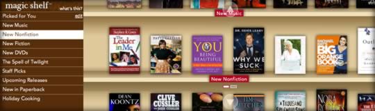
This provides the visitor with a much more engaging way to interact with this promotional content, while keeping the use of home page real estate to a manageable size.
Click on a title and an informative ‘preview window’ pops up with a summary of the product.
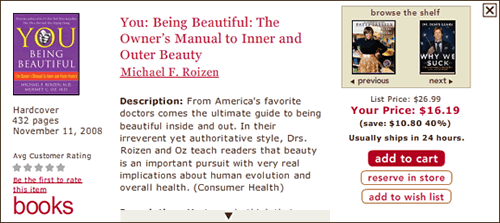
Although the design of the preview window could be improved (it’s rather plain), I appreciate being able to navigate through the current row of products from within the pop-up without having to open and close it to read about different titles.
That being said, it might be better if the preview window opened on mouse over rather than on-click, and you should be able to click outside of the pop-up to close it.
If I could level another criticism, I’d say that the presentation of the list of categories on the left could do with some refinement. For example, why not try to better integrate it into the book store/bookshelf metaphor?
Perhaps the choices could be presented more like a column of catalog cards that slide out when you mouse over them.
Something along the lines of the interactivity of the ‘Solutions’ section (bottom left) of Apple’s support page might work.