Summer is approaching, and along with it thoughts of vacations and where to go this year. With this in mind, I thought I would take a look at the official tourism websites of the most popular countries for tourists, as ranked by the United Nations World Tourism Organization, and see how well they help those looking to make this important travel decision.
1. France
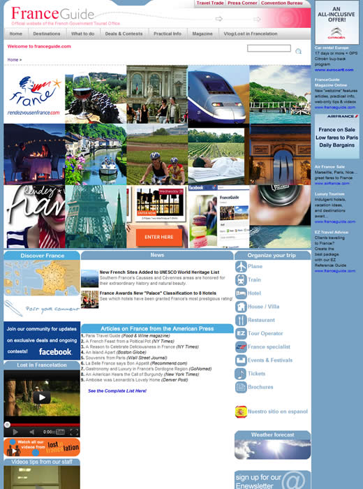
Despite being the most popular tourist destination in the world, actually finding France’s tourism website is something of a struggle as it does not show up on page one of a Google search for ‘france tourism.’
The site itself looks dated and untidy, with a curious strip of ads running down the right hand side. Outdated banners such as ‘celebrate New Year 2011 with us’ and a copyright date of 2008 do not provide confidence that the information in the site will be current or well maintained.
2. USA
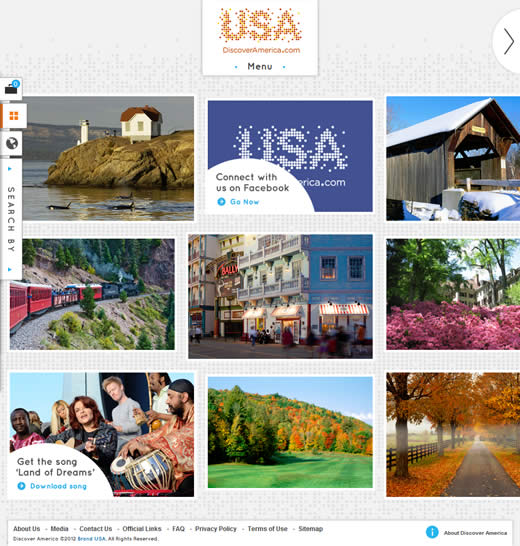
The USA tourism website on the other hand, looks very appealing when you arrive at it. The site is full of neat interactive touches and resizes based on the dimensions of the browser window.
I’m not sure why the main navigation is hidden away at the top of the page, however. There does not appear to be anything to be gained from not making the navigation and search more obviously accessible.
Similarly, some very useful tools (such as the map) are hidden under some small tabs on the left hand side. I wonder how many people even think to use these.
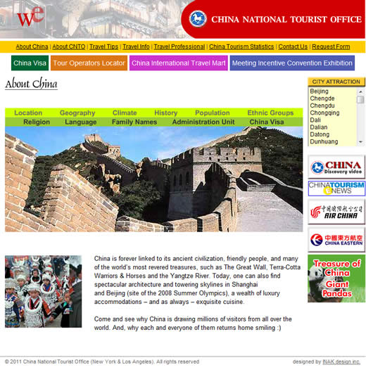
3. China
In a surprise retro move, China’s tourism website actually greets you with a splash page:
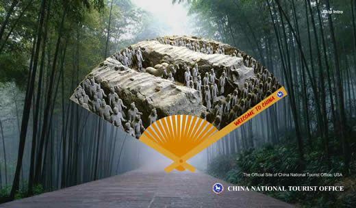
Once you’ve returned from your trip down memory lane (remember when splash pages were popular?), the official tourism website is little improvement. Apart from looking extremely dated and ugly, there is probably more information available on Wikipedia.
4. Spain
Although it uses engaging imagery throughout, Spain’s tourist website features little in the way of interactivity. You can’t even click on the main banner to learn more about the scene being portrayed.
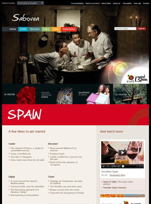
The main navigation options are particularly cryptic — what is the difference between ‘Come’, ‘Discover’, ‘Enjoy’, and ‘Experience’? I still don’t know, even after I’ve browsed around the site for a while.
The home page is swimming in white space, yet it does not include a map despite all the room for one.
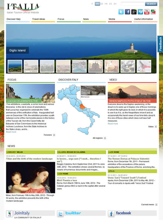
5. Italy
The website of the Italian tourist office is well organized and attractively presented, with great use of images (including this gorgeous background image).
Incredibly, it is one of the few websites on this list to display a map on the home page, although it still employs some strangely worded primary navigation — ‘Focus’? — and you cannot click on any of the home page banners to learn more about that part of the country.
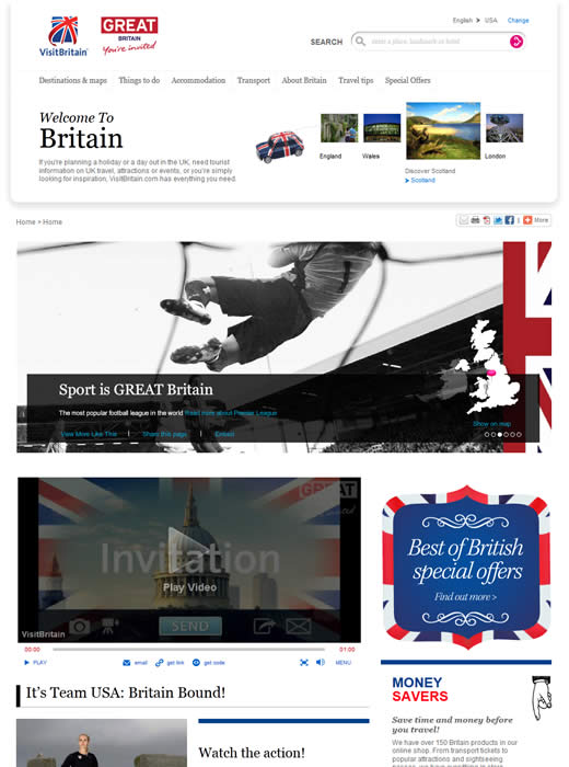
6. United Kingdom
The UK’s tourism website has certainly the longest home page of all the sites on this list, at over 3200px long. The light, typographically-based design features bold use of color and some nice design flourishes and elements.
The navigation is easy to understand, with straight-forward labels, and although there is no map on the home page, the ‘Destinations & maps’ section is well laid out making it easy to learn about the different parts of the country.
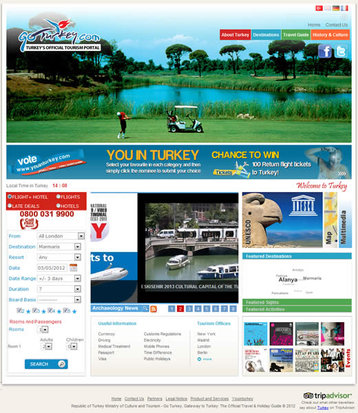
7. Turkey
When I first arrived at Turkey’s official tourist site it was not immediately apparent that I was on the official government website. The vacation planner tool and the Flash banner made it feel more like a commercial travel website.
The site design is rudimentary and the home page layout does a poor job of orienting the first time visitor. The various options are hidden behind content sliders, making it easier to head straight for the clearly written main navigation to find out where to go.
8. Germany
Thanks to the attractive background images, the tourism website for Germany is best viewed full screen. The site features a modern design and a considerable depth of content.
A country map is prominently displayed on the home page; however, once I clicked through to the interactive map, I found it extremely confusing and unintuitive to use.
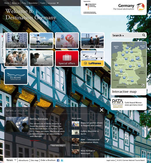
Although the navigation options are clearly laid out and labelled on the home page, once you are within the site it becomes difficult to navigate to other sections.
You have to click on a small drop down menu enigmatically called ‘Themes’ in order to access the main site navigation.
9. Malaysia
An emphasis of imagery over usability and content means that Malaysia’s official tourist site is challenging to use.
For some reason, the main navigation is at the bottom of the page, and — not surprisingly — it’s the first site on this list to place the logo way off to the bottom right of the page.
The home page makes a strange use of side tabs to access main parts of the site, and also features a selection of almost unintelligible buttons on the left side of the page.
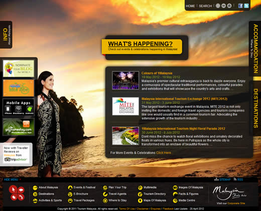
As you browse the site, the strange content layout and sparse content starts to make the site feel more difficult to use than is worth it. On the plus side, the imagery is nice, although a little staged.
However, if you re-size the browser window, the background image stretches to fit the dimensions of the window, making for some oddly shaped people.
10. Mexico
When you arrive at Mexico’s tourism site the colorful home page and logo certainly put you in the vacation mood. The site design as a whole is fairly basic, with little thought to white space and typography, but it is functional and easy to use.
The main navigation is clearly labelled, with the exception of ‘Activities’ and ‘Experiences’ — I have no idea of the difference between these two options.
When you are browsing the site, the light grey text on a white background does not help readability and the typography is consistently poor. Grey links do not aid usability either.
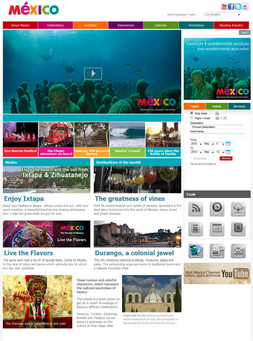
Surprisingly, there is no map on the home page, in the navigation, or in the ‘Destinations’ section of the site. Even when you view a particular destination, there is still no map of where it is located in Mexico.
The only map I could find is on the ‘About Mexico’ page, which just shows you where the different states are located.
Lastly, it was surprising how few of the websites used their country’s own TLD (e.g. .us or .co.uk) in the domain name. I did not expect .com to be the most popular extension for government-run websites.
The TLDs for the 10 sites broke down as follows:
- .com = 5
- .org = 1
- .info = 1
- .it = 1
- .travel = 1
- .gov.my = 1
Luckily Norway does it somewhat better: http://www.visitnorway.com
I’m surprised you didn’t include Switzerland. Switzerland’s official website is really quite good, especially because you can find a lot of information about regions, hotels and other stuff. Don’t really like the design that much, though.
MySwitzerland
I’m sure there are plenty of better tourism websites. However, I limited my list to the 10 most popular countries to see how much effort they went to online to help their visitors.
.com is the default international TLD though so it makes sense when you are appealing to a worldwide audience.
Im pretty disappointed with Great Britain site. The Germany site beats in hands down.
The US site is nice with lots of components and easy to navigate
I loved the German Website
I prefere the german and the malaysian websites – because they use these large pics in the background. for me this is more emotional than sites with more containers and text.
Some of these sites look like they need some serious updating, but a few are great.
We’re currently working on a similar site so this post is very helpful. Got a few very good ideas from the sites showcased here. Thanks for sharing