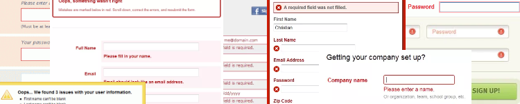
An important part of designing any kind of registration or login form is how you handle when things go wrong — a required field is missed or data is entered incorrectly. How do you inform the user that they have made a mistake and help them in fixing it?
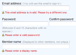
I thought it would be useful to collect some good examples of error message design to show how other web designers have tackled this issue.
Although often different in the specifics of their approach, these samples provide a sense of the main principles of good error message design:
- Show where the error(s) occurred in the form.
- Clearly explain what the error is (and how to fix it).
- Use color and possibly icons to make the error information stand out.
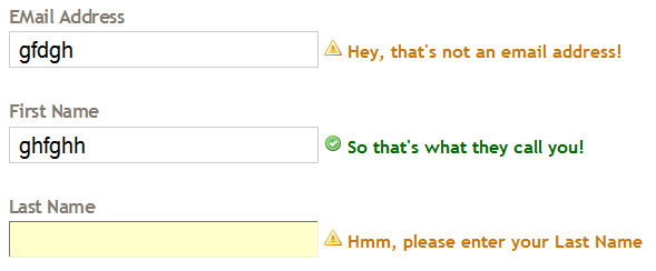
Not all of these examples are perfect. Some I’ve included more for the way they take a slightly different approach to a common problem.
However, in doing my research I was surprised by how poorly error messages are implemented on many sites. In many cases it seemed to have been added as an afterthought or without the involvement of a web designer.
View the error message design showcase.