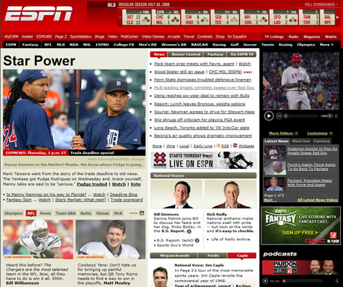
I’ve been looking over the ESPN site redesign today. I managed to find a screenshot of the previous version of the home page to compare the new design against:
Old ESPN Website
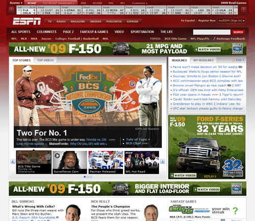
New ESPN Website
ESPN have included a page detailing the new features of the redesign, although at first glance you’d be forgiven for thinking that its main goal was to provide more ad space.
Judging from the overwhelmingly negative feedback — 500 comments and counting — the new design is taking some getting used to.
Then again, unless the existing site is pretty broken, redesigns tend to be fairly unpopular.
I also remember wishing that Facebook would go back to its old layout when it redesigned last year. Now, of course, I’m familiar with the new design and I can’t even remember what the old design looked like.
Thanks to Mike Davidson for a balanced post on the redesign, which sums up some of its pros and cons and also the issues the designers faced.
Many of the comments about the redesign revolve around the site being slow to load, the flyout navigation getting in the way, and content being hard to find.
I am not a user of the ESPN site, but visually it doesn’t feel like much of an improvement. Certainly, it’s not a huge leap forward in terms of modernizing the design.
Looking at the redesign solely from a visual standpoint, one issue may be that the background image clashes with the colors of the advertising, making the home page feel more cluttered and messy.
If you’re going to have a lot of colorful advertising on your site you really need the color scheme of the site to not compete with your advertising.
To that end, ESPN may be better off with a much plainer design.
As a quick test, here’s how the site looks with no background image:
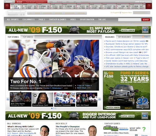
To me, it already feels a little cleaner and more cohesive, although of course it doesn’t fix any structural or content issues that exist and that your users are really going to care about.
Either way, the ESPN team has a way to go to match the likes of SI.com which manages to have a clean, uncluttered layout while at the same time presenting a ton of information on the home page.