A couple of recent posts showcasing icon use in navigation menus got me thinking again about icon design for the web.
Back in 2007, I wrote a post questioning the value of using icons in site navigation. My main rationale was that icons are useful when they provide meaning. If they don’t provide meaning they are just embellishments – eye candy, if you will.
However, in order for icons to provide meaning, usage conventions have to arise so that designers use them consistently and appropriately.
For desktop and web applications, icon conventions are well followed – the floppy disk for ‘save,’ scissors to represent ‘cut,’ a blank sheet of paper for ‘new document.’
When it comes to websites in general, and in particular, website navigation, very few conventions have arisen concerning icon use. The main one, of course, is the house icon for ‘home.’
This lack of consistency makes it difficult for web designers to use icons for navigation in a way that will help visitors actually use the site.
I thought it would be interesting to look the icons highlighted by the two articles above, and see if any conventions (or ‘design patterns’) could be identified that web designers would do well to follow in using them as a navigation aide.
About Us

It’s clear that there is a strong consensus for using a humanoid shape or group of shapes to represent the About Us page.
Portfolio

The use of a briefcase to represent a portfolio of work is common enough to be recommended as a convention.
The exception to this might be if the work is in a different medium such as video or audio, where the use of another icon would be more appropriate for that audience.
Blog

There is a less strong convention here, but it is notable how the speech bubble has become a popular way to represent a blog. This was a discovery for me, as I hadn’t realized that there was any sort of agreement regarding using icons to represent blogs.
Contact Us

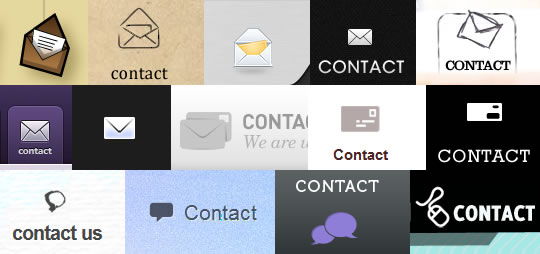
The contact page has traditionally been represented by an envelope icon, and that convention is clearly in evidence here.
It’s worth noting that with the rise in popularity of the speech bubble to represent a blog, it could be confusing to a visitor if a site uses this icon to represent their contact page.
I’d be keen to hear about any other web-related icon design conventions or patterns that have become widely used. Please feel free to share in the comments.