Following on from my recent post about why you shouldn’t use rotating image carousels I wanted to share the actual stats for a auto-rotating carousel on a key page of an ecommerce site I manage in order to look at how effective it is for showcasing multiple pieces of content.
Here is the event-tracking data from Google Analytics showing clicks for a two week period in which all five banners were live:
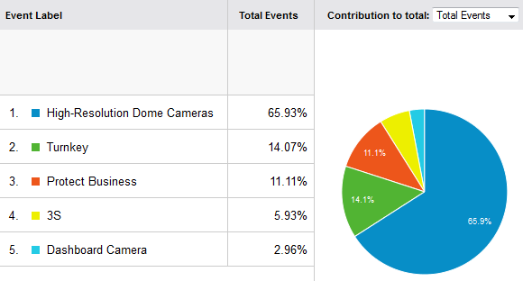
Not surprisingly, the first banner received the lion’s share of clicks with 66%. From there, the click-through rate rapidly dropped off to 14% and then 11% (banners 2 and 3), with banners 4 and 5 receiving only 9% of clicks between them.
As a result of this data I replaced the carousel with a single, static banner. Combined with a planned out editorial calendar, this will be just as effective and much easier to manage.
Despite the arguments against them, if you do want to maintain an image carousel on your site, this data seems to support the recommendation to limit the number of banners to three at most.
I would also recommend that you ensure each banner receives time in position #1 in order for it to receive a meaningful volume of traffic.
Of course, this data also serves to show that rotating image carousels are not an effective way to give (almost) equal prominence – say, on the home page – to multiple pieces of content or offers as the only position on the carousel worth holding is the first.
I’ve posted similar stats here: http://weedygarden.net/2013/01/carousel-stats/ and follow-up stats here:http://weedygarden.net/2013/07/carousel-interaction-stats/ with similar results. The only site out of the five that I’ve tested has auto-rotation enabled.
Christian, thanks for sharing your data. Can you compare total clicks for two similar time periods? I’m wondering whether carousels have ANY positive effect that can be measured. For example, did the carousel reduce the overall click-through rate from the home page, by chance? (That’s the Nielsen idea, that the carousels contribute to banner blindness and that users skip them entirely.)