We’ve been dabbling with infographic design at work as a way to generate backlinks. We recently published a new one about the rising issue of copper theft (hey, I work in the security industry).
You can see it below:
As I’m still new to the whole business of creating infographics, I would be very interested in any feedback about this one.
Do you like it overall? What elements work and which ones do not? Is it visual enough?
That sort of thing. Thanks in advance for any feedback you can provide.
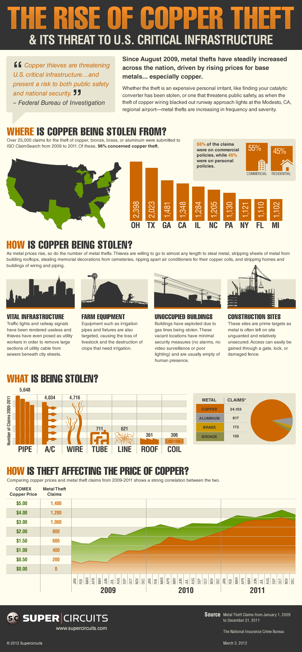
Your article is a good illustration of how copper theft is affecting our infrastructure, builders, and the private homeowner. It’s a big problem. Now, if I wanted to read the smaller print, I’d need to get my glasses out and/or put it on a bigger screen but the headlines are fine.
Just upon a perfunctory glance, make sure your map is correct. Ohio has the highest theft rate but is not highlighted on the map.
The price of copper isn’t going up *because* people are stealing it, people are stealing it because the price is high enough to make it worth stealing.
Ben — great catch! I’m from the UK originally so I never picked up on that.
Lance — you’re absolutely right. That headline should be reversed to “How the price of copper is affecting theft.”
Thanks for the comments, they are much appreciated!
You can make several other improvements in the infographics such as larger font size and can give some pictorial representations.
hi
Really its a big problem.some peoples don’t no about this issue. They don’t no the value of copper.
We have copper plumbing in our house and live in CA – #4 location of copper theft. You just got me nervous :/ any idea of how homeowners can prevent it from getting stolen?
your pie chart shows the 96% quoted above… first off, don’t separate the data from the picture. Second, I think it is bad practice to fudge the graph for visibility (there is no way that that non-copper wedge is only 1/25th of the circle – 14.4 deg). There are other visual solutions.
Second comment is that there is too much text in the commercial/residential breakdown graphic… a big title like “Breakdown of Claims” is better.
Finally, I think way too much text in the “How copper is being stolen” section. The graphical icons are a nice touch there and I like the layout, but it is too much text for an infographic. Words are wasted on sentences that don’t provide much incremental data.
Love your stuff in general, which is why I’m taking time to post.
@Alex — (shameless plug) you could always purchase a “video security system”:http://www.supercircuits.com/Security-Camera-Systems/4-Camera-Systems/ to protect your home. They are surprisingly affordable.
@Andy — thanks for the feedback! We’re still trying to find the balance between producing attractive, informative infographics not spending an inordinate amount of time on them, so I appreciate your observations.
Nice work!
I’m looking to learn more about designing infographics too… What software is best to use? Illustrator?
Very well made infographic !
The design is great but i’ve noticed that the “buckets” or individual pictorial elements (for lack of a better term) are relatively the same size so your eyes don’t really know which part of it is the most important part. I would suggest making a hierarchy of which ones are the most important and emphasising them by making them bigger (making others smaller) and etc.