There’s been quite a lot in the tech press about “Gizmo”:http://www.gizmoproject.com/ — one of several web-phone services that are cropping up to challenge Skype.
I’m a user and big fan of “Jajah”:www.jajah.com, but I’m always interested in the best deal, so I decided to check out Gizmo.
When I’m checking out a new application I first like to get an overall sense of how it works and looks. I clicked on the link to view Gizmo’s features and was presented with an extremely busy image of everything that it can do:
p(image). 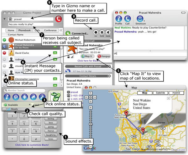
View full size image
h2. Busy = Confusing?
A few things immediately struck me about this image:
# Having such a complex image makes Gizmo look complicated and potentially hard-to-use.
# The order of features implies an importance which I found confusing. I’m not sure which are the most important features, but I’m sure it’s not the fact that you can add sound effects to your calls. Which makes it odd that this is listed as #1.
# Some of the features are sequential in their use — i.e. you have to call someone (feature #9) before they can receive the subject of your call (#7). I guess you’d probably check their online status (#4) before you tried to call them at all. It would likely make sense to list these features in the order they would be used.
It’s a truism to say that you don’t have long to grab someone’s attention on the web, but this does mean that you have to look at every aspect of your site and make sure that you are presenting information (making your pitch) in a clear and engaging way.
I’m sure Gizmo is a great product, but all I got from this image was information overload.
h2. Keep it Simple
It would be better to present the features (in order of importance or usage) as separate screenshots with an individual description for each or — ideally — as some sort of Flash demo.
If someone is going to make the investment of subscribing to your service, they’re highly likely to take the time to watch a demo of how it works. Jajah does a good job of this on their site, as does “Rebtel”:www.rebtel.com/.
Here’s an example I threw together very quickly using the online slideshow service “RockYou”:www.rockyou.com and a chopped-up version of Gizmo’s original image.
p{margin-top:2em}. Of course, if I was going to do this properly I’d create the slideshow from scratch in Flash or use a tool like “SlideShowPro”:slideshowpro.net/. But you get the point.
This peaked my interest.
Agreed what usability is concerned – less is most certainly more in UI design.
But – just out of curiosity – how does it fare?
Compared to Jajah or Skype, when you try to do what
you want to do. Placing a call?
I actually haven’t used the software itself. I was just commenting on the web site. I dare say it’s pretty decent.
However, there comes a time when you’ve got to pick a tool/solution and stick with it, which is why I’m going to stay with Jajah as it works fine for me.