In case you didn’t know, Britain will be electing its next government on May 6. In keeping with the spirit of the election, I am taking a look at the websites of the three main parties, starting with the incumbent, the Labour Party.
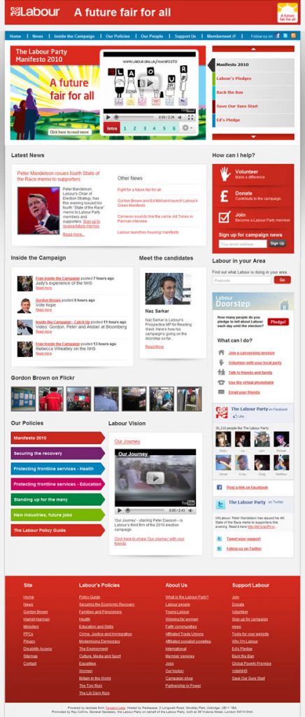
Labour’s slogan is “A future fair for all.” In case you missed it, they’ve repeated it three times on the home page. Surprisingly for what I imagine is a fairly content-heavy website, there is no site search.
Labour’s color is red, and the site does a reasonable job of using that core color, without making your eyes bleed.
I’m not sure why the header is separated from the main navigation. At first I thought it was a browser bug.
I’m also not keen on the -large gray smudge- graduated gray background behind the main body of the site — it just looks dirty.
The main navigation is straightforward but unimaginative, with the requisite social media icons easily accessible.
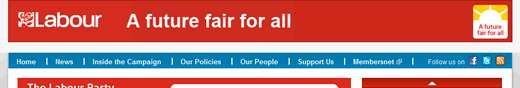
It’s too bad that the “Support Us” drop down has some z-index issues with the content behind it.
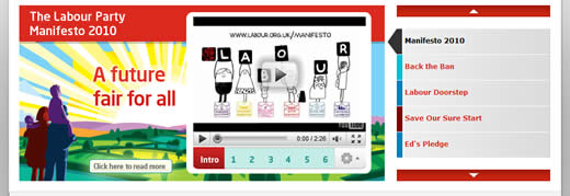
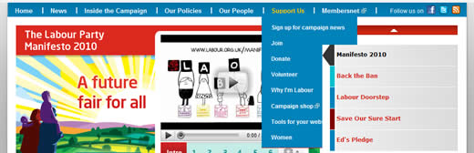
The hero promo feels busy and complicated. Here is a great place for Labour to drive home its key policies through strong messaging. Instead visitors are expected to sit through minutes of tiny video.
Maybe it’s me, but I didn’t realize that the hero promo was actually a carousel and that the slides were controlled by the navigation section to its right.
This appeared so disassociated with the main promo area that I thought these were simply shortcut links into the site.
As you move down the home page, the grid seems to get thrown out the window. The layout of the content boxes loses any sort of overall cohesion.
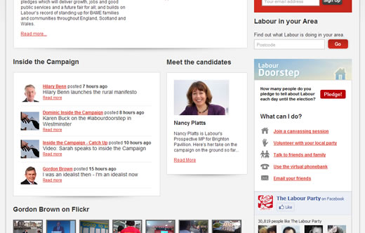
Seeing as many visitors to the website will be looking to learn more about Labour’s policies, I’m surprised that they’re listed so far down the page.
I can’t believe that pics of Prime Minister Gordon Brown on Flickr are more important in helping voters to decide which way to cast their ballot.
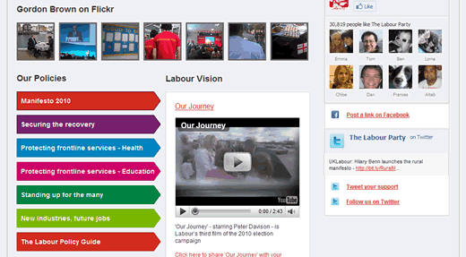
The names of the policy links are pretty awful. “Standing up for the many” doesn’t give you much to go on, and using basically the same link for Health and Education is very unimaginative.
What’s the difference between “Securing the recovery” and “New industries, future jobs?” As a visitor, I don’t have a clear idea of where either of those links will take me.
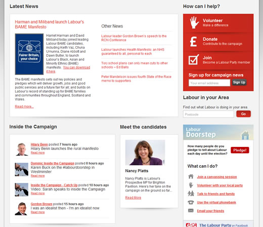
Over on the right sidebar the “How Can I Help?” section clearly outlines how you can get involved in Labour’s campaign with bold icons and clear labeling.
It’s not clear to me why it’s almost immediately followed by the “Labour Doorstep” section with essentially the same links. Surely these two areas could have been combined into one?
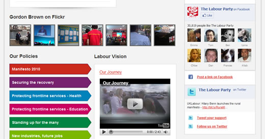
The Facebook and Twitter social media sections further down on the right feel too large and are awkwardly implemented, especially with the lack of white space between these content areas.
Although small, the “Meet the Candidates” content box will be useless for most visitors. Unless that candidate is campaigning in your constituency, they have absolutely no relevancy to you.
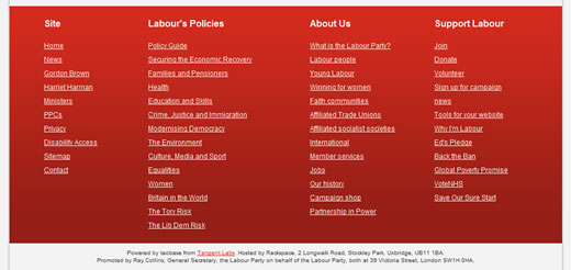
I do like the sitemap-style footer, which makes it easy to access any part of the site.
Overall, the site feels rushed and lacks the polish I would expect from a major political party, especially with the experience of the 2008 US elections to draw from.
Next, the Conservatives.