
Weather.com recently partnered with design agency Makeable to redesign their popular mobile app, largely with good results, in my opinion.
Although the reviews of the latest version of the app on iTunes might disagree, it’s well known that people hate change.
One area of the Weather.com app redesign that did surprise me was in the decision not to use color in the icons displaying the weather for each time period.
In my experience of using the new app, this makes it less easy to scan and quickly get an understanding of the upcoming weather conditions.
Here is how the new hourly forecast design looks:
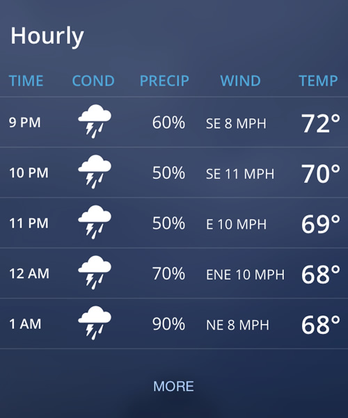
To show what I mean by the lack of color reducing comprehension, I thought I would try adding back in the color to the icons to see if they became more recognizable.
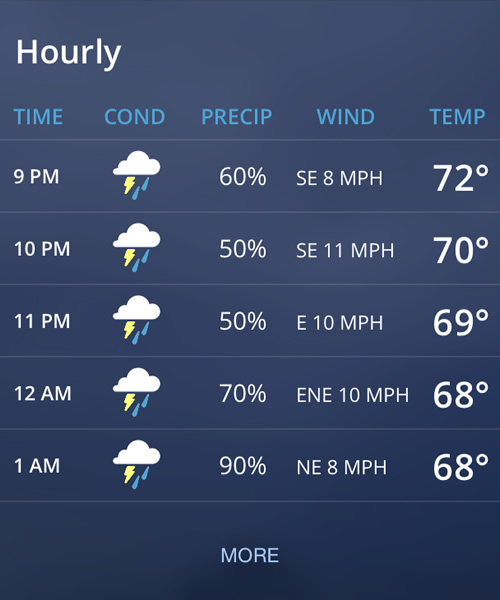
For example, compare the above forecast of thundery showers to the version below that uses color in the icons. Which is quicker to take in at-a-glance?
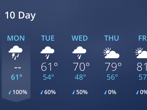
When looking at the 10-day forecast, with variable weather conditions, I believe the issue becomes more noticeable.
In addition, the new app design requires you to swipe the screen to see days 6 through 10, so you cannot see the full forecast on a single screen:
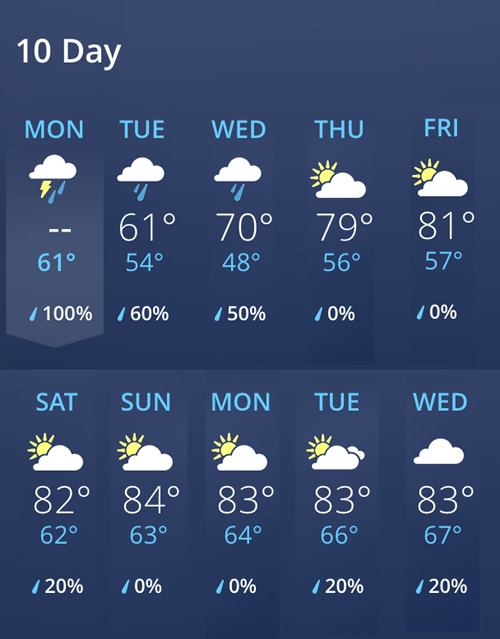
Compare the current version (above) with my redesigned 10-day forecast which puts the complete forecast on a single screen and adds color to the icons (please excuse my makeshift Photoshop skills).
Which version lets you understand 10-day forecast the quickest?
These are small details, admittedly. But small details like these build upon each other, so that together they impact the overall usability of the app more than you would expect by looking at any one issue alone.
Update: Well, it looks like the Weather.com app designers took my suggestions to heart, or (more likely) they listened to the feedback of their users, as the app now has colored icons, as the screenshot below shows.
They still need to fix the 10-day forecast, but maybe that is to come.
Pretty useful and simple. Nice alternative to see the weather. Thanks for share.