Everyone loves tourists (or rather, their money). And US states are no exception. That’s why they have departments of tourism to promote them, and an official state tourism web site to do the same online.
Of course, since there are 50 states, there’s a lot of competition for those tourist dollars, especially if you’re not a destination state such as Florida or California.
So, you’d think that the official tourism web site for each state would try to show off its best ‘assets’ to maximum effect.
At least, I did — and I was wrong; very wrong in some cases.
The design quality of state department of tourism web sites ranges from top notch to not so much (where do you start?) with many lying somewhere in between.
So, let’s have a look at these sites (or, at least, their home pages) in more detail. Most importantly, which ones actually made me want to visit?
All lists are in alphabetical order.
The Best US State Tourism Websites
California
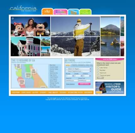
A static image doesn’t do this site justice as it’s very animated. Sums up what I expect the Californian experience to be very well.
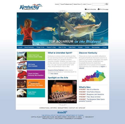
Kentucky
Minnesota
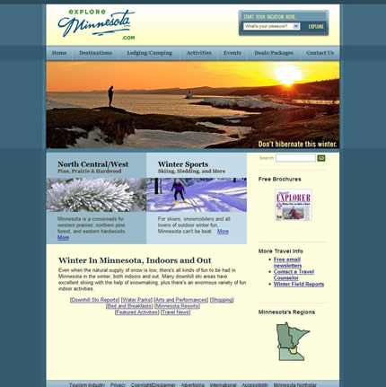
Uses the phrase “What’s your pleasure?” for its ‘quick links’ drop down list. Nice touch.
North Carolina
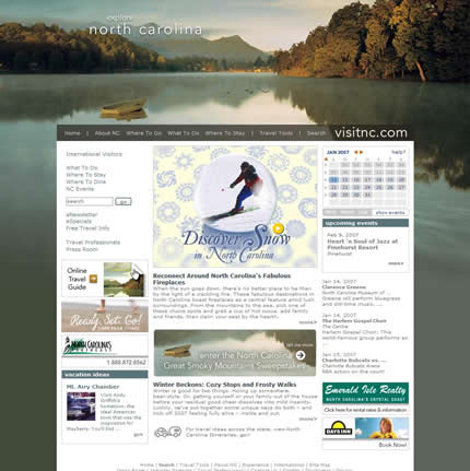
Excellent use of imagery. Definitely a pleasure to look at.
Oregon
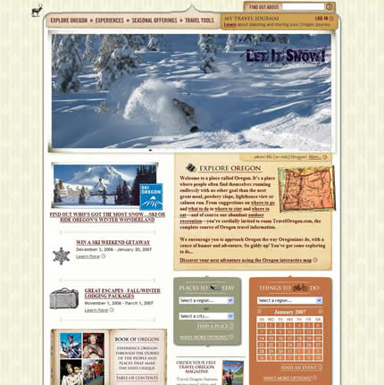
Wonderful design — my joint favorite along with Tennessee. Very nicely implemented Flash slide show.
South Dakota
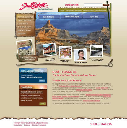
Perhaps the biggest surprise of the lot. Made my best list because I didn’t know what South Dakota was like but now I’m definitely intrigued to find out more based on the home page. They can lose the pink text though.
Tennessee
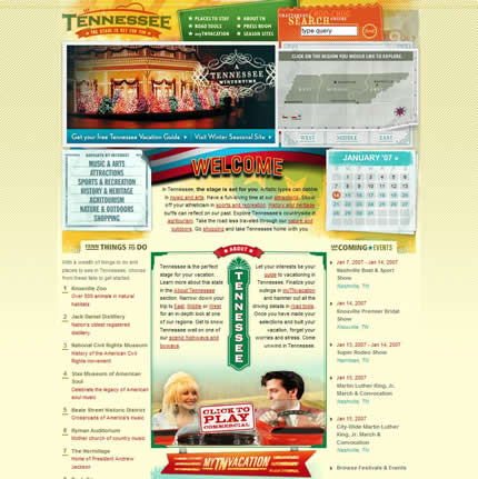
Fabulous design with wonderful attention to the details. Practically screams at you that there is lots to do in Tennessee.
Texas
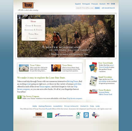
Breaks stereotypes of the state with an elegantly executed design.
Utah
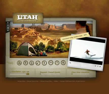
This is a great looking design — talk about an advert for the state!
Yes, there are some negatives — the unnecessary use of Flash to build the whole page, the lack of any real content and the ‘mystery meat’ navigation.
But does it make me want to visit? Heck yes it does.
The Second Tier
Alabama
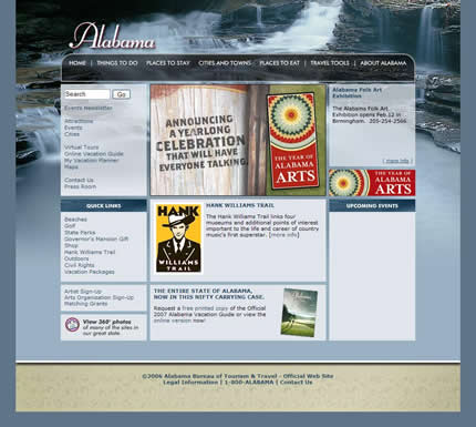
Very nearly made it into my ‘best’ list. However, according to their web site, the state of Alabama doesn’t have any upcoming events.
Not a good sign for anyone planning a visit.
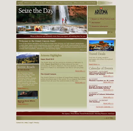
Arizona
Colorado
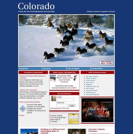
That superb image makes me want to grab my snowboard and come visit.
Best tag line also — “Fresh air and fond memories served daily.” Where do I book my flight?!
Connecticut
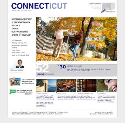
Certainly a well constructed site, although the design is perhaps a little too sterile.
Delaware
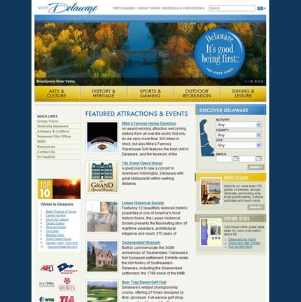
Delaware has the joint worst tag line for “It’s good being first.” And why would that be exactly?
Illinois
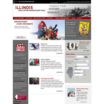
Except for the frigid color scheme, this is a nicely design site and a well laid-out home page.
Pennsylvania
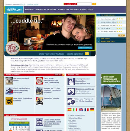
Kudos to Pennsylvania for venturing into the realm of user-submitted content.
However, what’s up with “> ready > set” for your search label? What’s wrong with “Search”?
The Rest of the State Tourism Websites
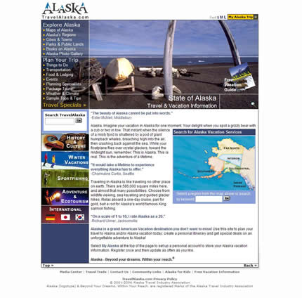
Alaska
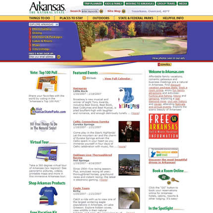
Arkansas
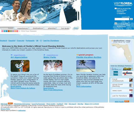
Florida
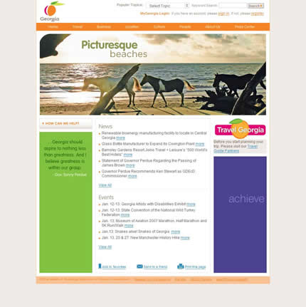
Georgia
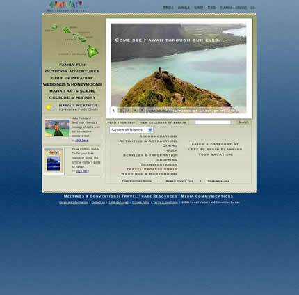
Hawaii
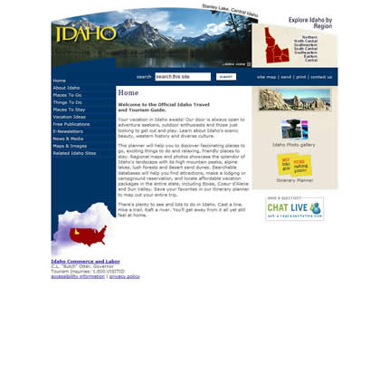
Idaho
Indiana
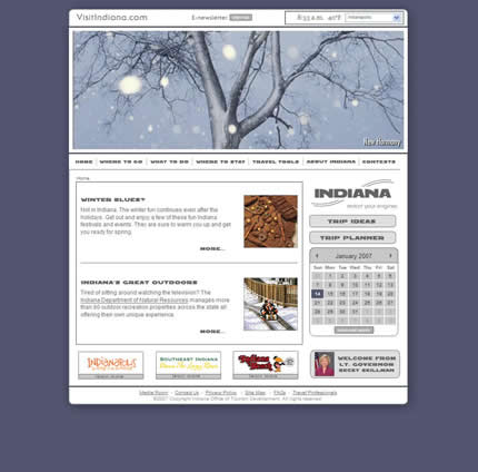
Could this home page make Indiana look any colder and grayer?
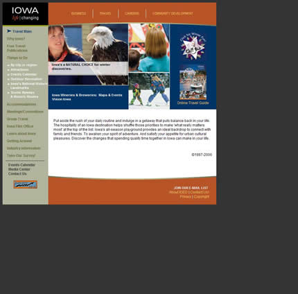
Iowa
Kansas
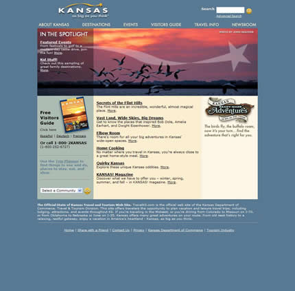
Kansas has the joint worst tag line for “as big as you think.” And that’s a good thing for a tourist?
Doesn’t that mean I just have to spend more time in the car getting to places?
Louisiana
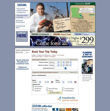
No mention of New Orleans? What gives?!
Maine
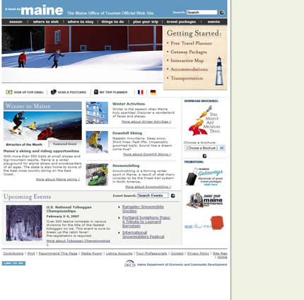
Maine has the joint worst tag line for “it must be Maine.” What on earth does this mean?
Maryland
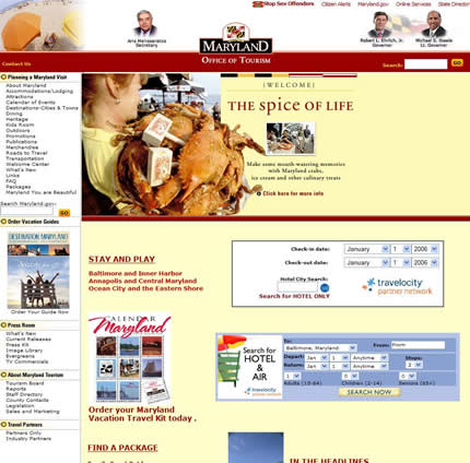
So, why are there photos of politicians in the masthead? Why is there a big “Stop Sex Offenders” link at the top of the page?
This is a tourism site remember — what kind of message is that going to send? And how about using a grid to layout your page?
Massachusetts
What’s up with the mystery meat navigation? Please don’t make me guess what I should be clicking on.
Michigan
Mississippi
Missouri
Montana
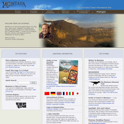
The wonderful images on the Montana home page are ruined by the poorly done feathering effect.
Nebraska
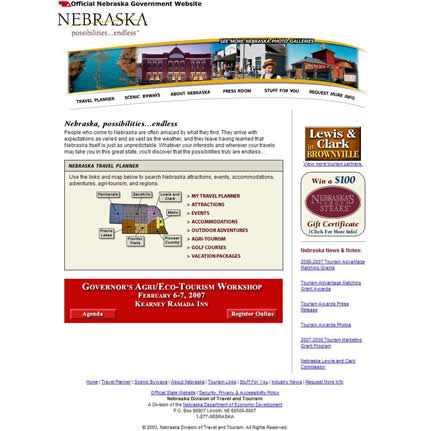
Why would anyone visit Nebraska based on its tourism web site? Having never visited, I know nothing about the state before I arrive at the site, and I still don’t once I do.
It doesn’t help that the copyright in the footer is 2003. I can see that they have a big “Agri/Eco-Tourism Workshop” coming up. Is that really what potential visitors want to know about?
Nevada
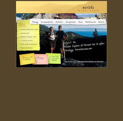
Nice try, but the whole post-it note, torn paper effect doesn’t really work (it’s a little clichéd) and falls apart once your mouse over the top navigation.
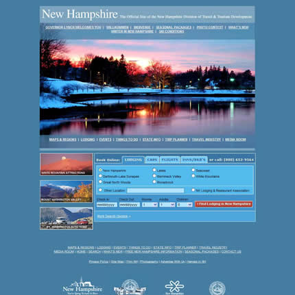
New Hampshire
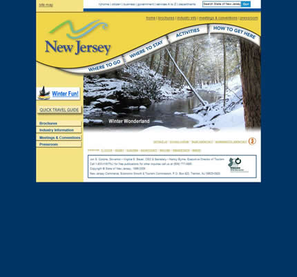
New Jersey
New Mexico
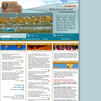
Why is “Take Our Survey” one of the main things you can do on this site?
This should be presented in a pop-up window or placed somewhere else on the home page, not in the main navigation bar.
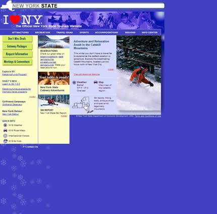
New York
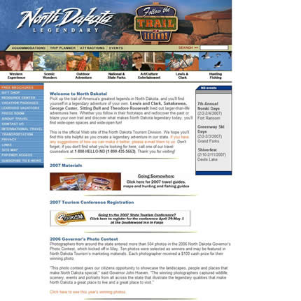
North Dakota
Ohio
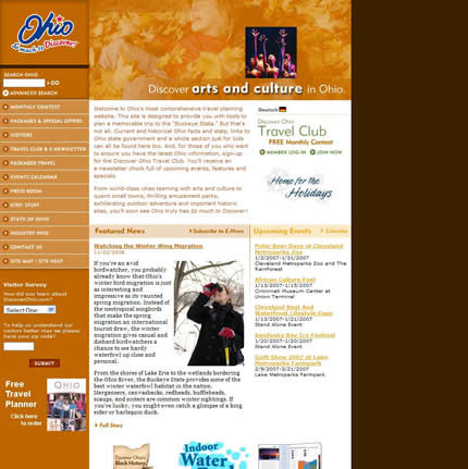
Apparently, it’s still fall (autumn) in Ohio.
Oklahoma
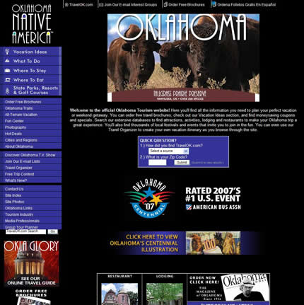
Words fail me.
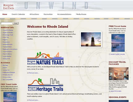
Rhode Island
South Carolina
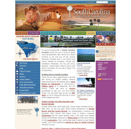
Could this home page be any more colorful? What’s the color scheme here — try anything and see if it sticks?
Vermont
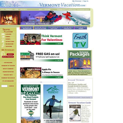
Is it me or does Vermont’s site just seem like it’s full of banner ads?
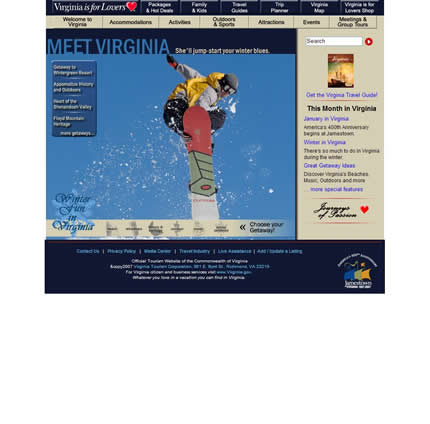
Virginia
Washington
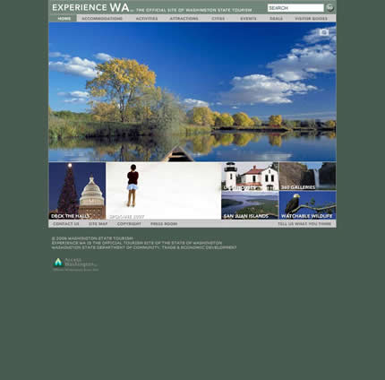
Nice photos but that all-Flash web site does not work in this context. Where’s the content?
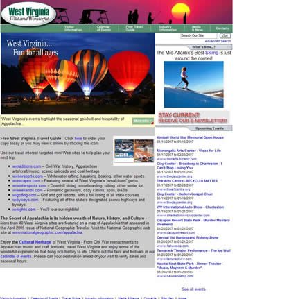
West Virginia
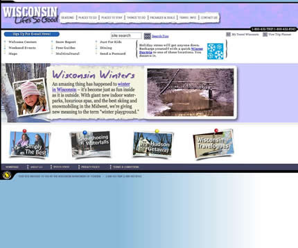
Wisconsin
Wyoming
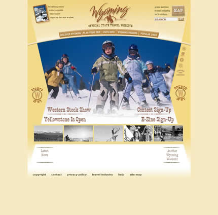
Another all-Flash web site. Sigh.
Update: I’ve updated the link and screenshot for Utah to be correct (find out why I mistakenly reviewed the wrong site). Rhode Island’s site is back online, so I’ve added the correct screen shot for them too.
“according to their web site, the state of Alabama doesn’t have any upcoming events.”
That’s really more of a data issue, don’t you think? I mean, you can’t really fault the designer if they hand over a site and the person responsible for entering events falls down on the job.
“Delaware has the joint worst tag line for “It’s good being first.” And why would that be exactly?”
Delaware was the first state to ratify the US Constitution (although this fact does nothing to answer your question, nor does it make me want to spend tourism dollars there).
An interesting browse. Actually I’m really surprised by the generally high visual standard – light years ahead of anything in the UK. Take this really stale example for Somerset in the South West of England – http://www.somerset.gov.uk/celebratingsomerset/.
*Jason* — it’s totally not the designer’s fault. However, as a visitor to the site, that’s not my problem. I just thought it was amusing; imagine if it was a top 10 list of things to do that was blank!
Re. Delaware; yes, I knew that, but that tag line still blows.
*Ed* — that’s too bad because Somerset is a wonderful place to visit.
This has got to be my favorite design-based blog entry ever. Don’t stop with states, please.
Honestly, I wish people would stop talking about rounded CSS borders or font families and actually DIG INTO the real web like you did here, instead of their own imagined fairytales of accessibility and good design.
Congrats.
Wow the NY website sucks
*Jeston* — thanks for the feedback! It’s certainly interesting to be able to browse through a bunch of sites all built around a common theme.
I think I bit off more than I could chew with 50 states. However, once I started, I couldn’t stop!
The gulf between the best and the worst sites is amazing. They really are a world apart. I also was surprised how important imagery was in conveying the ‘essence’ of a state. Some of the sites really nailed this aspect.
I like this a lot! Even though I’m biased since I live in NC, I’ve always loved their state website, especially since there are several different background images you can see, and they’re all very well done.
As part of the team that built the Kentucky Tourism site (HTML, CSS, and non .NET generated JavaScript were my contribution), I’m pleased to see it so well received.
Of course, the grain of salt is that this is just one person’s opinion, but we at least pleased one person out there in cyberspace. 🙂
Can the residents of Washington, DC get any representation for the DC tourism website here? We don’t have representation in Congress (sadly taxation without representation still exists), so it would be nice to get some love here.
New York’s is bad…I agree. I am not sure who did it but it’s either gone to the lowest bidder (an outside vendor) or else it was done by someone paid by the state. Nuff said.
I enjoy doing this with college/university websites since I am paying out all that money.
Brilliant work, made me think of doing something equal for Germany, but after checking some results…
– http://www.bayern.de/
– http://www.hessen.de/
– http://www.berlin.de/
– http://www.niedersachsen.de/
I loved looking at these opinions. Although, I must give kudos to the Alabama site, they have updated the one fault that bumped them from the “best”. Tons of upcoming events, makes me want to be a tourist at home!
The residents of Washington, DC are going to be sad to know that I would put their tourism website at the bottom of the list as well.
The search bar that runs at the top, as a first impression, destroys the rest of the site visually.
The very fast flash entrance to the main navigation (I blinked and missed it, so I was forced to reload to see what it said) needs to be put on Ritalin.
DC has so many beautiful monuments, museums, streetscapes, but can you tell that by their picture choice?
I stopped there, not because I wanted to, but because past that, there is not much going on.
I don’t mean to step on your toes, but this is an opinion-based forum.
You should do one with countries.. Here is my country, Turkey!
Your screenshot of Utah is not current. Try again!
What about Washington, DC?????
*Bryce* — great job on a nicely designed site.
What I would love to know is whether having a better designed site actually generates more tourism dollars. I wish there were more case studies about the business impact of doing site redesigns.
At the end of the day, a web site is just a business tool. However, this aspect seems to get overlooked when we talk about site design.
Certainly, a quick review of Alexa rankings for some of these sites reveals that high traffic is not related to how well the site is designed.
*Brad* — thanks for the review!
*ilker* — I have thought about that. Maybe someone else could take up that particular baton?
You want to see some scary web design? Look at the state library websites or their Department of Education websites. I interned for a state government doing web design and you would not believe the red tape, and the wrong people making design decisions that web designers encounter when working for State agencies.
Yeah, it was fall here in Ohio weatherwise until about 2 days ago.
NY really needs to redesign theirs. Come on….it’s NY!
Rhode Island Tourism just moved their offices, servers, and whatnot, and have had problems all week. Haven’t seen the site, but hopefully once it’s back up, you’ll post it.
Thanks for taking such time to do this analysis. Interesting to see all the states sites at once along with comments. I would like to say, not sure with other states but I know with Indiana’s website, it is a pay-to-play concept. So, not all events, attractions or other info is included for all cities unless they ante up. I’m glad I happened across your blog.
This article stinks. It doesn’t take into account the different requirements any state may be given to design a site.
Sometimes sites are developed by high end design firms that are only interested in the bottom line. And the specifications are being given by persons that may not understand the internet.
Unfortunately the end user is normally the person that has to suffer bureaucratic design decisions. What an internet we could have if all development was left up to the design professionals and usability experts.
Did you even run any accessibility tests on any of these sites?
Your favorite site is loaded with tables and the styles are all embedded. Wouldn’t it be more proficient to use linked styles and positioning. I also don’t understand why you say Cali has a good site with a huge Flash block on the main page used only for “sparkle†yet other sites that employ Flash as a data element are Ho Hum.
Perhaps you should go back and look at these sites again from a development point of view.
Ohio has redesigned theirs – much different now.
http://consumer.discoverohio.com/
Being from Colorado, it pains me to say it, but I have to admit that I think I like the Texas site the best. Nice clean layout, mellow colors, responsible use of Flash, and the most responsible use of inline javascript of all those top tier websites you list. Nice work Texas!
A novel idea that is getting attention from every state tourism office today. Your opinions are generating lots of questions and discussion. That is an excellent thing even if people disgree with your views.
Nevada is in the process of launching a new site – look for it in the next 30 days – i think you will be impressed.
Don’t forget your Canadian neighbors! Starting on the west coast here is Vancouver’s website: http://www.tourismvancouver.com. Welcome any feedback.
Unfortunately Utah’s government information site rather than its consumer site (utah.com) was used for comparison in this overview. The state tourism office in Utah also has utah.travel.
NY and Wisconsin’s are the worst. That’s too bad because I’m from Milwaukee :(.
*Jen* — I was wondering why the site was down.
However, that’s pretty poor contingency planning. We are in the process of moving our “hospital web site”:http://www.seattlechildrens.org to a new server and the site will be down for a couple of minutes at most.
*Rob* — that is a “great looking site”:http://consumer.discoverohio.com . It would have been in my ‘best’ list for what it’s worth.
However, I found all of these sites by typing “visit [state name]” into Google, and the site I posted is the one that came up for Ohio. Why do they have two tourism sites anyway? Seems rather confusing to me.
Ohio launched there new site the same day you reviewed. google probably hadn’t indexed the new site yet.
*Addison* — I’d love to hear some of those discussions! And, you’re right, these are just my views, rightly or wrongly (although I like to think I can spot an ugly site when I see one!)
*Debra* — perhaps you can post a link in the comments once it’s live.
*Kelly* — yes, I see that I did showcase the wrong site. However, it’s interesting to look at why I did so. I just wrote a “new post”:https://smileycat.com/miaow/archives/000326.html about exactly that. You might find it interesting.
These sights are big commercials…when I want to learn about a place I want real information…sights like Sogonow.com or tripadvisor.com offer more real and useful content
What did you like about Kentucky’s site? I didn’t see your comments listed under the screen capture, as they are for the other sites. (I like it too)
Interesting article! I’d love to see one done for the Canadian provinces and territories, seeing as we share the same continent, and we’re competing for a lot of the same tourism dollars.
Do you have a clue how State Tourism sites are built?
Do you realize that every state has a different Budget?
And by the looks of how you ranked the States it looks like those that ranked well are those with lots of $$.
Get the facts before you hammer on these different States that do with what they can afford.
*Joe* — in short, the Kentucky site appealed to me. I liked the clean design, nice-looking Flash banner and the well-presented content. It all came together in a package that made me interested in visiting the state.
*Curtis* — I don’t believe that good design is solely related to budget. There’s really no excuse for designing something ugly these days; given the wealth of examples from which to draw inspiration and the resources available concerning every aspect of design.
On top of that there are numerous sites which provide “free web site templates”:https://smileycat.com/miaow/archives/000210.html , some of which are extremely well designed.
This is an excellent case study and a good example of first impressions. A place, person, or company’s website definitely reflects upon them and can make or break a decision upon choosing their service.
Great idea!!
Would love to see a comparison of cities like you did with the state tourism sites. Other types of categories would be interesting, too (like newspapers, for example).
Here’s two losers from my neck of the woods:
http://www.norfolk.gov
http://www.dailypress.com
I really enjoyed this idea and article so much that I decided to do the same to my home country, Australia!
Which Australian State Would You Visit
Christian,
While I don’t think the new Kentucky Tourism site has been live long enough for the Department of Tourism to see if the revenue dollars generated by the new design make for a significant ROI, I can speak from personal experience about the allure of the designs. While getting ready for this project, the Kentucky.gov team visited every state tourism site, noting what we loved about it, and what we hated, and whether the site’s design was the best way to market the state as a product. Personally speaking, the state’s w/ the “cooler” sites were the ones that I wanted to go and visit. Now whether that translates into me dropping my tourist dollars in their laps is another thing, but it did do something in setting them apart from the pack in my mind. So, there’s some feedback from a focus group of one person. 🙂
Also, for what it’s worth, our assessment of state tourism sites pretty much paralleled yours. However our particular favorite was the North Carolina site, and we were a little more impressed w/ the Georgia site than you were and considered it one of the top sites.
Thanks for such a comprehensive overview. Had this article come out before we started the Kentucky site, you could have saved us a LOT of Googling. 🙂
*Bryce* — I agree with you about the ‘appeal’ factor.
I’m also interested in whether a couple of other audiences are important to these sites:
* People who might be tempted to extend a business trip to include a weekend away
* People living within the state who might be persuaded to vacation ‘at home’
As for the Georgia site, I found nothing wrong with it; however it felt very generic to me. I felt like that template could have been used for almost any type of web site — there was nothing about it that ‘called to me’ (for want of a better term).
Very nice analysis, i think there arent so much bad cases, some designs are very attractives!
Great blog, one more reader =)