About two years ago, I posted a review of US state tourism web sites, in which I uncovered a range of web site design going all the way from great to downright ugly. More recently, Sam Dunn did his own summary of 22 well-designed state tourism web sites.
Comparing Sam’s picks for the best state tourism web sites against their 2007 counterparts made me go back and look through my own list to see how all the sites had changed.
All I can say is “What a difference two years makes.” Note: all screenshots were taken in a 1024×768 browser window.
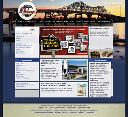
Alabama
Alabama’s web site was good to begin with:
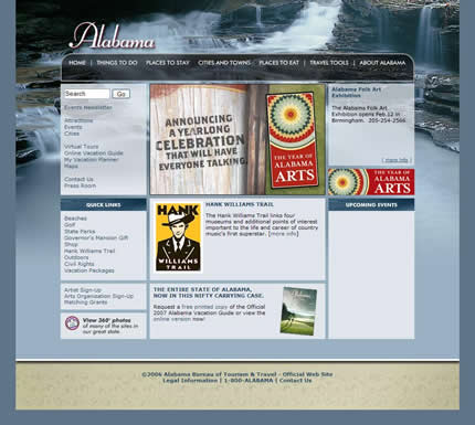
So I’m not too surprised that it hasn’t really changed:
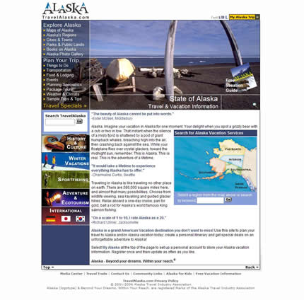
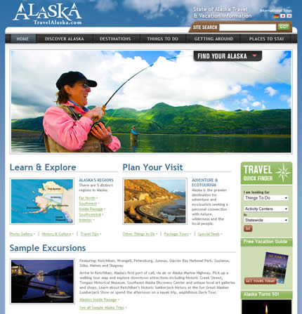
Alaska
This dull and uninviting site was in dire need of a redesign:
What an improvement! The new site is much more modern and appealing:
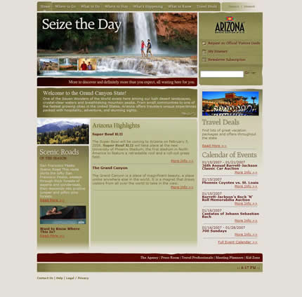
Arizona
The old site was mediocre in terms of design and overdid it with the desert color scheme (yes, we get it — Arizona is dusty):
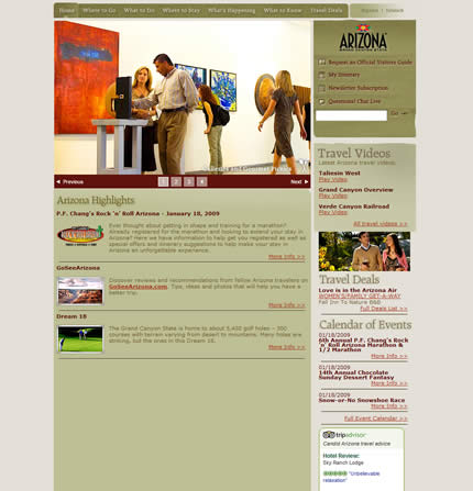
For some reason no one at the tourism has felt the need to do much at all with the site since. If anything, the layout of the home page has taken a step backwards:
Arkansas
Arkansas’ tourism site has undergone a transformation, going from an ancient-looking:

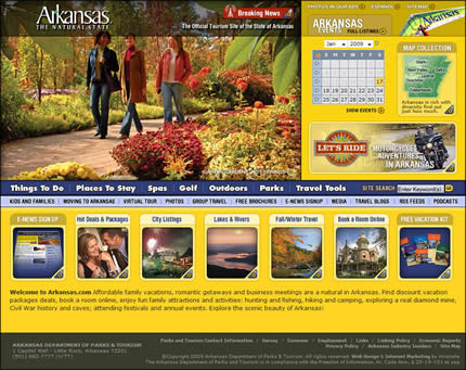
To a much more modern, vibrant, content-rich (and yes, very yellow) design:
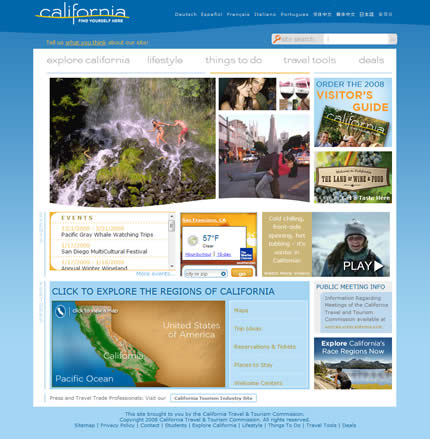
California
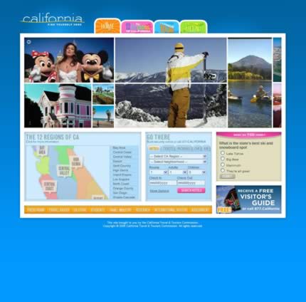
I liked the California site before, even though the home page was all done in Flash:
Apparently, the all-Flash approach didn’t work out as it has gone, although the new site still retains the flavor of the old one and is nicely organized:
Colorado
Other than having great imagery, Colorado’s site was fairly workmanlike in its design:
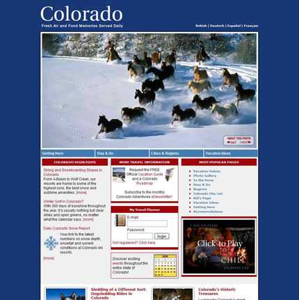
The current site is much improved, with a super Flash carousel and a much cleaner layout, which although it verges on being a little on the empty side:

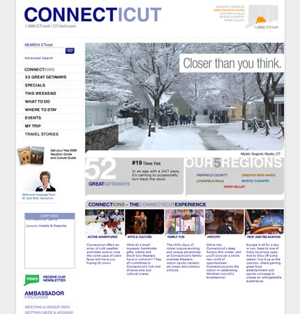
Connecticut
Having a pretty decent, albeit somewhat stark, site to begin with:
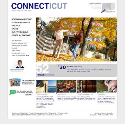
Connecticut have opted to not really change much at all. A little color wouldn’t go amiss:
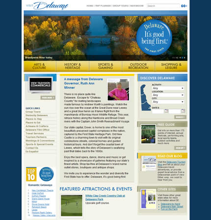
Delaware
Delaware’s site wasn’t bad, but was already looking dated in 2007:
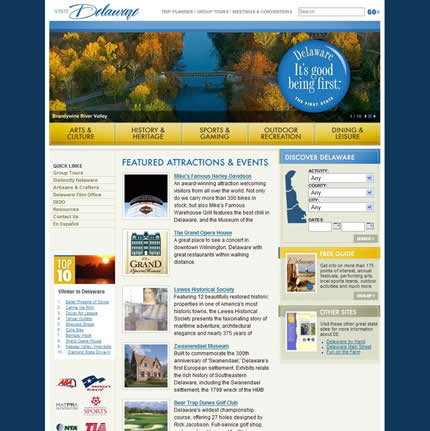
Well, there’s been no redesign and for some reason the potentially useful “attractions & events” section has been pushed down to make room for a letter from the governor:
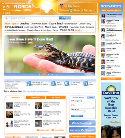
Florida
Florida’s web site captured the feel of the state well, although it had a few layout issues:

The new web site is a marked improvement, with a lot to see and do as you plan your trip:
Georgia
Georgia’s site was pretty but a little bland:

The new site is an improvement, both in terms of the visuals and in bringing more functionality and information to the home page:

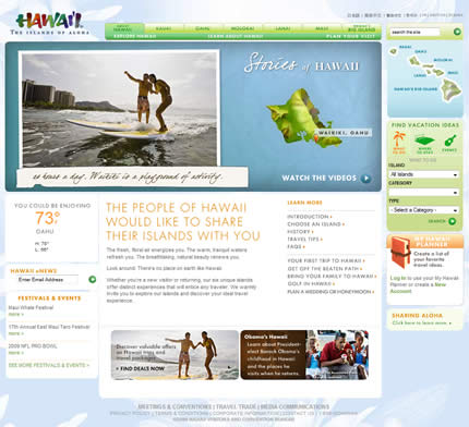
Hawaii
The old site wasn’t too bad at all, although it was a little sparse on home page content:
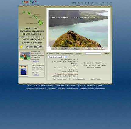
The current site does a much better job of representing the idea of Hawaii as well as bringing a lot more content and interactivity to the forefront:
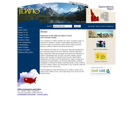
Idaho
The old site was in need of a redesign, with a dated design that underserved the features of the state:
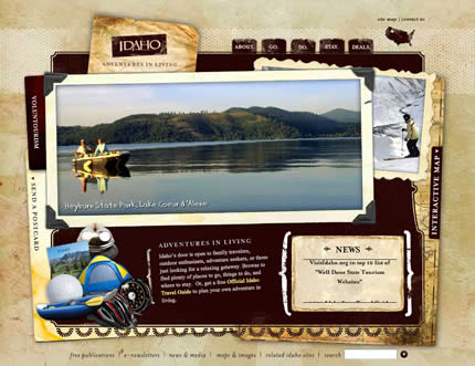
Although a little rigid in terms of layout, the new site is much more appealing:
Illinois
Illinois’ site was well organized but rather cold and uninviting:

Strangely, the redesigned site is even more so (it reminds me of John McCain’s infamous ‘black’ web site):

Indiana
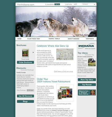
The old site gave a wonderful impression of how damn cold it must be there right now (although I’m not sure if this was intentional):

Although the current site uses a little more color, the layout of the home page has degraded over time and it doesn’t feel as integrated as the previous design:
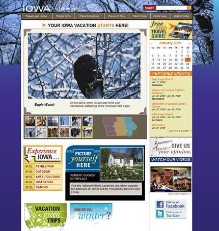
Iowa
The old site was in desperate need of a redesign — even the imagery was awful:

And what a great redesign it turned out to be. The home page is brimming with content, color, vacation ideas and tools. I’m not quite sure what happened with the background image implementation, but this is a small detail:
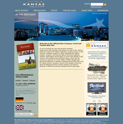
Kansas
Two years ago the Kansas site had a fairly uninspiring, middle-of-the-road site design:
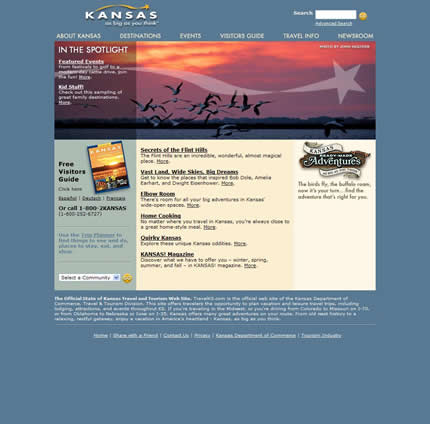
Well, it hasn’t changed except to remove a great chunk of content from the center of the home page and add a “welcome to our web site” heading:
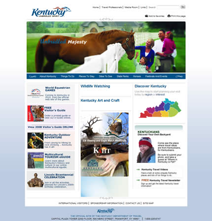
Kentucky
Kentucky’s old site was appealing to look at and well laid out:
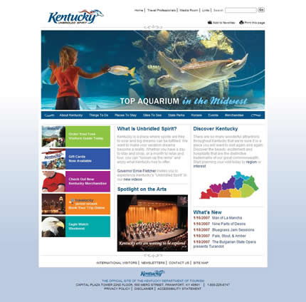
So it’s not surprising that they’ve chosen to stick with the design:
Louisiana
The old web site felt oddly broken into two parts, with a giant trip booking tool that took over far too much of the home page:

The redesigned site is a considerable improvement with a pleasing design and a much greater focus on content:

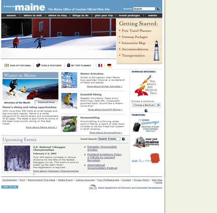
Maine
Maine’s site looked perfectly acceptable a year ago:
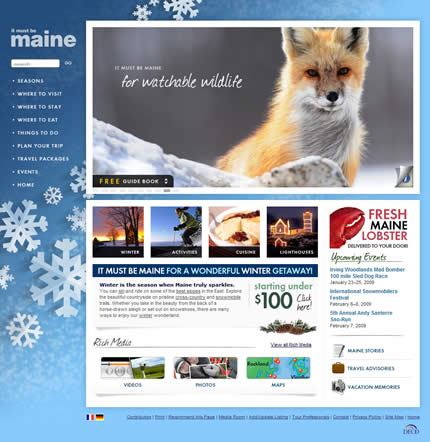
However, I much prefer their redesign. Here’s how to present winter without it looking cold and dreary:
Maryland
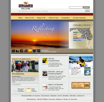
Back in 2007, Maryland had one of the worst-designed web sites:

Although not a contender for ‘best of the bunch,’ its redesign has at least brought it up to par:
Massachusetts
Massachusetts has gone from a very dated looking home page and design:

To one which feels much more contemporary and is content-rich and actually useful:

Michigan
The old site was certainly full of content, but suffered from a lackluster design:
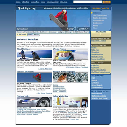
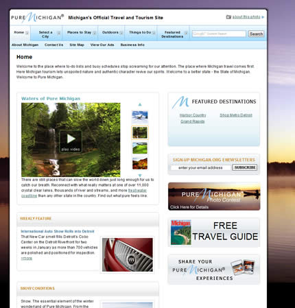
The redesigned site is a big improvement in terms of overall design and layout, although it feels in need of some bolder imagery and color choices:
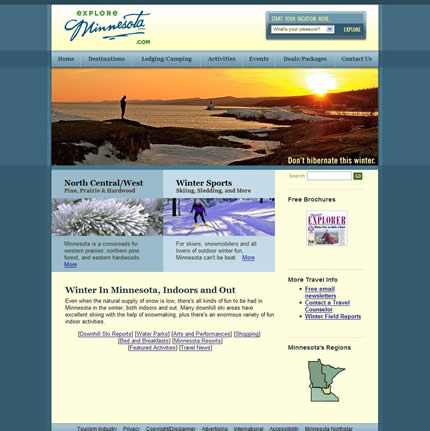
Minnesota
In 2007 Minnesota’s site looked great above the fold but then seemed to run out of ideas as you scrolled down:
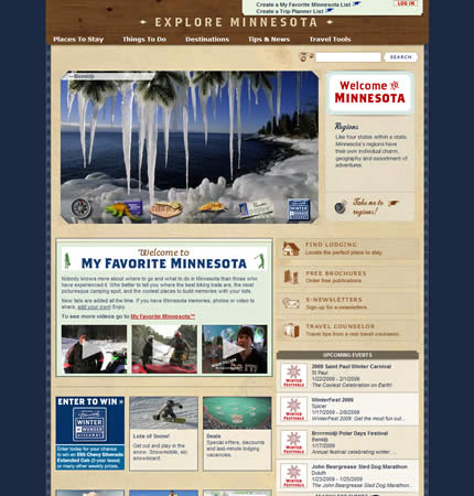
The new site is more interesting to look at and has a more cohesive home page design.
However, on closer inspection it feels like it needs one more pass to turn it into a truly great design:
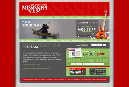
Mississippi
I found the color scheme of the old site to be pretty unappealing and the overall layout rather uninspiring:
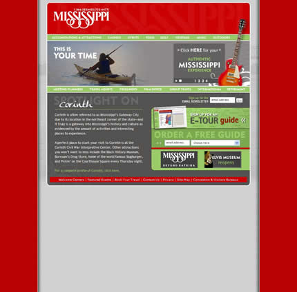
Incredibly, the design of the site hasn’t changed a bit in 2 years:
Missouri
While the old site wasn’t bad, once you got below the fold there wasn’t much to recommend from a design standpoint:
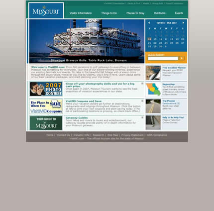
The new site has certainly made some bold design choices, although I’m not sure they entirely work once you move down into the content area.
I also have no idea why the search box is so huge:

So, that’s my roundup of US state tourism sites 1 to 25. Stay tuned for the rest and some concluding thoughts in part 2.